
Website review #12 - Gabriel Lazcano
Introduction

Gabriel has submitted his website for review on March 20 after my tweet asking for followers' websites. So without further ado, 2 months later, here's the review!
The good
This website is fast
Gabriel has probably used a static-site generator like Gatsby, Next or Jekyll (not sure which, I'd love to know) because this website is fast. Kudos to Gabriel for making this a great experience!
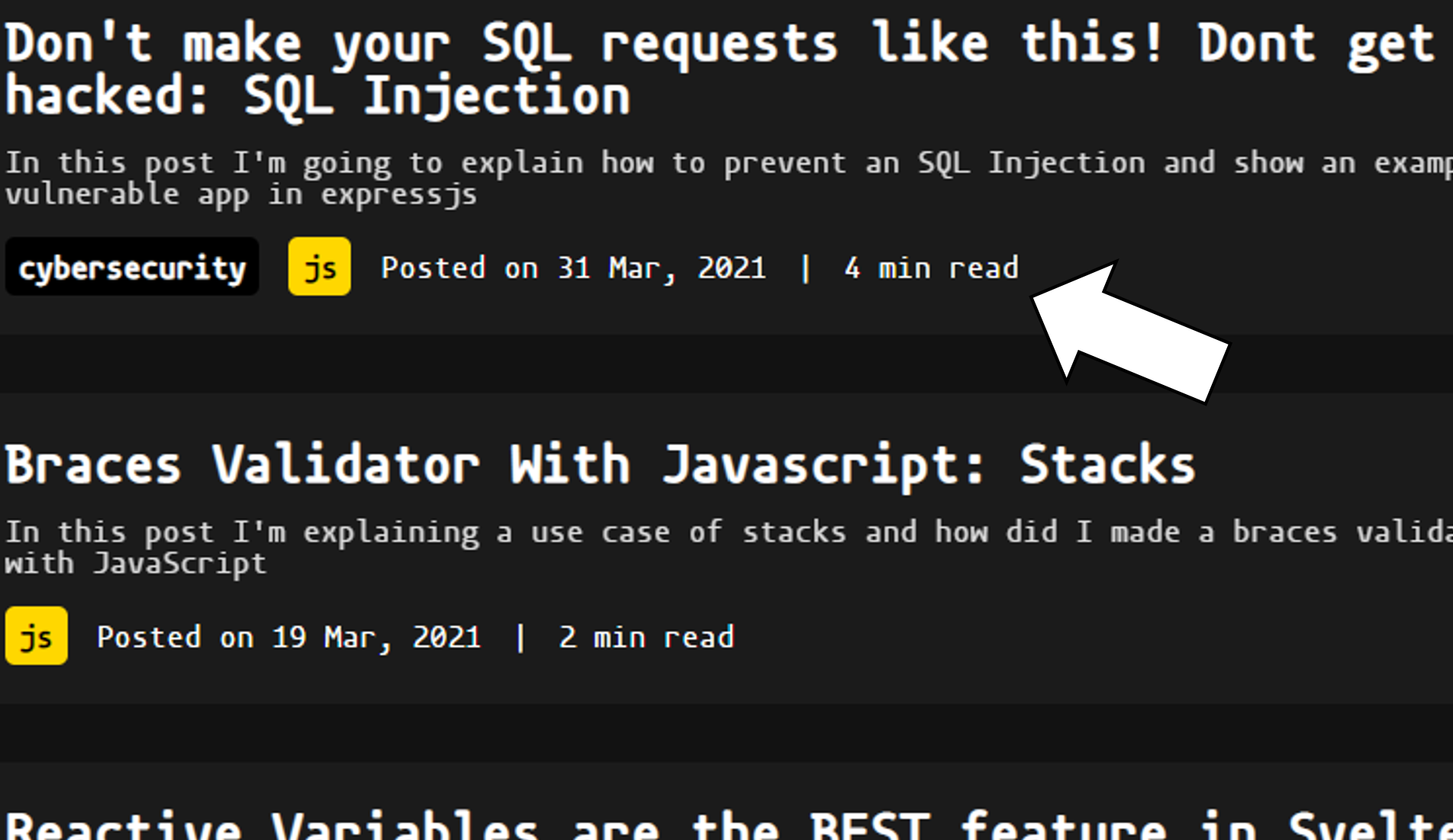
X minute read
Gabriel’s website has a handy "X min read" under each of his articles. This is very helpful in setting expectations for the visitor.
A clean design
Gabriel has avoided making his website too busy with unnecessary clutter. The article he has written take centre stage with some additional links that don’t take up much space.
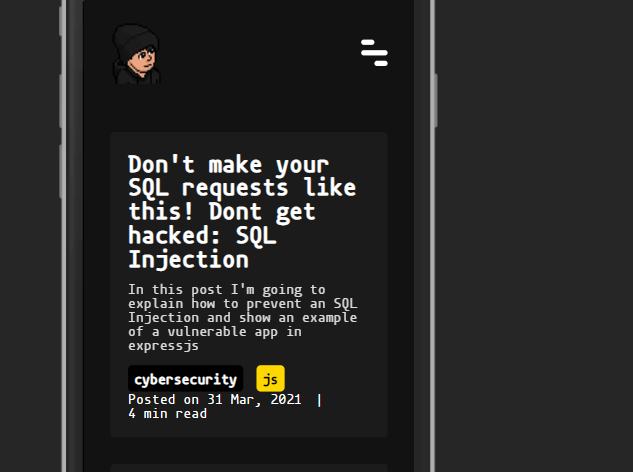
Responsive
Gabriel has made sure his website works great on mobile! He has added a handy hamburger menu on the top right corner for the menu, thus decluttering the website even more!
Great use of semantic HTML
Gabriel has done an amazing job at implementing semantic HTML instead of a bunch of div tags. The website uses main, article, aside tags among others, which makes it an greatly accessible website!
Keyboard accessible
Everything on the website is accessible using just the keyboard. Great job!
Works without Javascript!
Generating the website using a static-site generator means that it can run without Javascript just as it would with it. This is awesome!
Suggestions for improvement
Empty About and Portfolio pages
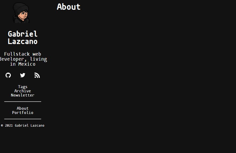
The About and Portfolio pages are empty. I understand that this is a work in progress but it’s best to not include these pages in your live version since it gives the impression of incompleteness.
What’s the number after the pencil?
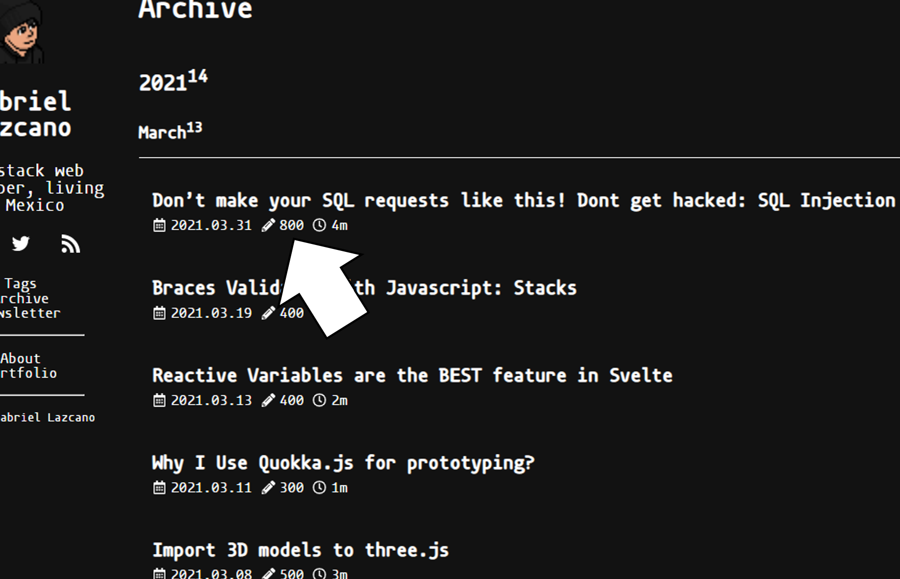
In the Archive page, I noticed a pencil with a number on it. What’s that number? What’s “800”? Is it the number of characters? It’s not clear.
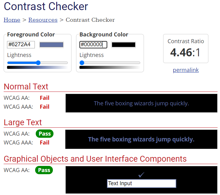
Some contrast issues
Some aspects of the page, specifically the comments in the code snippets have insufficient contrast between the text and the background
According to WebAIM’s Contrast Checker, the contrast ratio for the code comments is 4.46:1 which is insufficient for normal text.
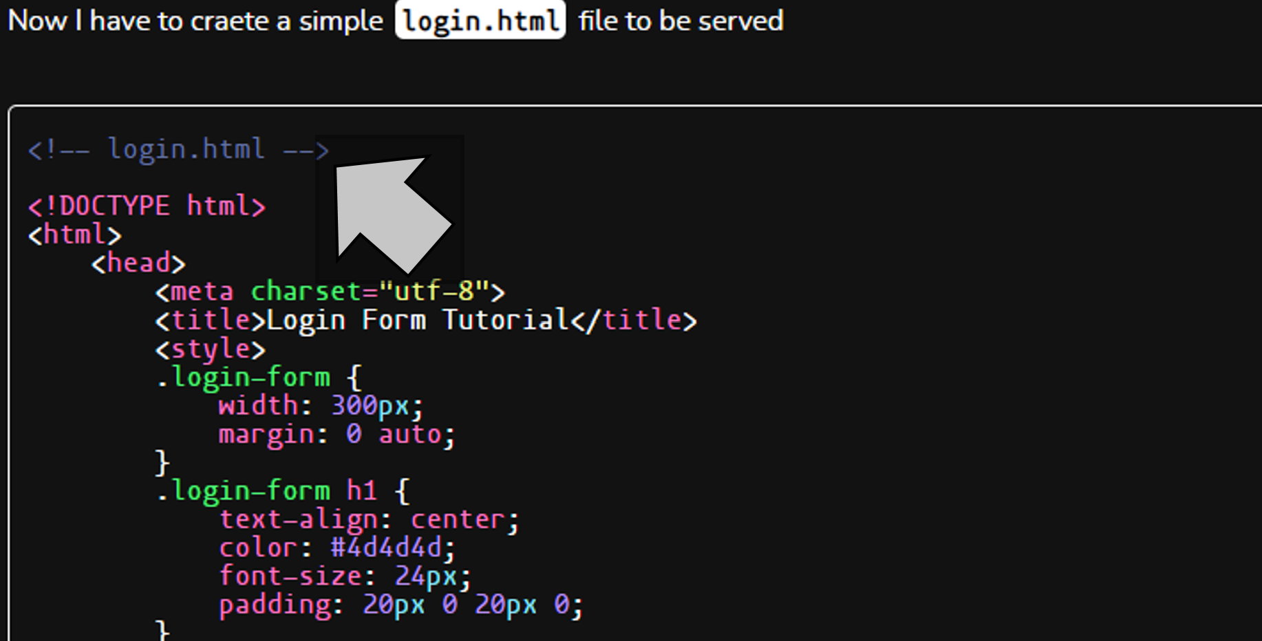
Usage of screenshots as code snippets
Although rare, some articles use screenshots as code snippets instead of actual code blocks. This is bad practice as you’re excluding screen reader users from accessing your code.
Needs header and footer tags
Previously I have praised Gabriel’s usage of semantic HTML, which is awesome. I would suggest the usage of header and footer tags as well for a more accessible website.
Conclusion
A blazing fast website, with some major accessibility wins and a beautiful design. Some minor improvements will make this perfect.
Score 9/10
Reviews (14 part series)
- Website review #1 - Cadejo.Dev (Vinicio Vladimir Sánchez Trejo)
- Website review #2 - Concrete and Lavender (Maria Spyrou)
- Website review #3 - Twitter Butler Digest
- Website review #4 - Coding with Ease (Godspower Eze)
- Website review #5 - Catalin Pit
- Website review #6 - Agathe Badia
- Website review #7 - DenisWritesCode (Denis Mutinda)
- Website review #8 - Timothy Adeyeye
- Website review #9 - Fauzi Arda
- Website review #10 - Tech Stack Banner (Andy Griffiths)
- Website review #11 - Baljeet Singh
- Website review #12 - Gabriel Lazcano
- Website Review #13 - SoftWar by RepublicOf1 (Benjamin Green)
- Website review #14 - Randy Davoh