Building a responsive website? Start with mobile first!
When designing a new responsive layout, which one do you do first, desktop or mobile? Here, I'll show you why it's best to develop the mobile version first and desktop second.
Two main reasons:
1. Start simple, enhance gradually
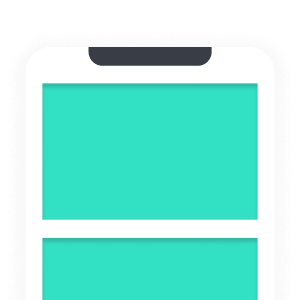
Take a look at the two layouts below, the left is mobile and the right is desktop:
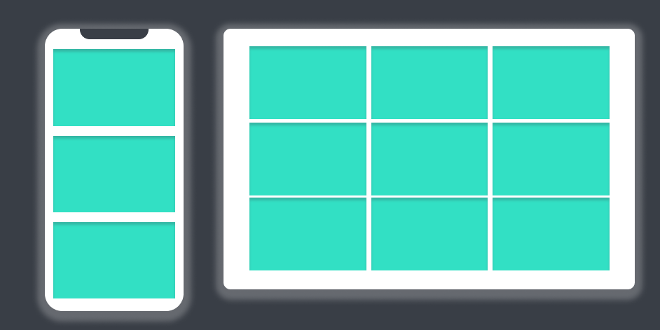
Which one of the two looks easier to build?
The mobile follows the "default" layout applied by all browsers without any special CSS, which is the "flow layout". So to keep things simple, start with the mobile layout and enhance to a grid for screen sizes that allow it:
#gallery{
    /* enter basic CSS to style the gallery here */
}

@media (min-width: 600px){
    #gallery{
        display: grid;
        grid-template-columns: repeat(3, 1fr);
    }
}
2. More people will visit your site on a phone than on a desktop
More and more people visit the Internet using their mobile devices, and there's a good chance that the same is true for your website.
Designing for mobile first, means you are developing for the growing majority of your visitors. You can later enhance for your desktop audience from that point on.
Thanks for reading. Do you build responsive layouts mobile first or desktop first? Why? Join the discussion on Twitter!