
The CSS Box Model, explained.
This is a website:
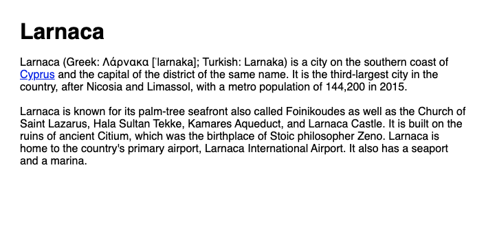
This simple website has these elements:
- A title
- Two paragraphs
- A link in the first paragraph.
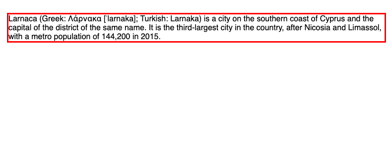
It's fair to say that each of these elements lives in its own little space, with its own little borders. It's also safe to say that these boundaries are shaped like squares.

These boxes aren't there just to put stuff on a page. The boxes the elements are in, are also used to style each element with CSS.
Let's focus for a minute, on a single paragraph.
Styling happens in various parts of the element's borders:
The content of the element…
The space within the border…
The border itself that wraps the content and the space inside it…

And the space outside the border
All these parts together make up an element's box.
This is why the way the layout and styling of an element within a box is called The Box Model.
The Box Model
Everything I've mentioned above is part of an element's box.
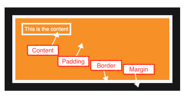
Content: the element's content. Usually text or other elements within it
Padding: the area around the content but within the borders of the element.
Border: The border mark itself.
Margin: The area outside the border mark.
All these parts can be styled individually, so let's see use some CSS to do that for each one.
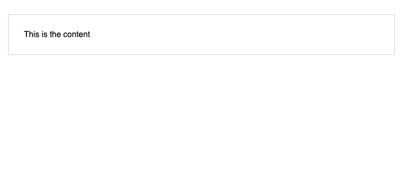
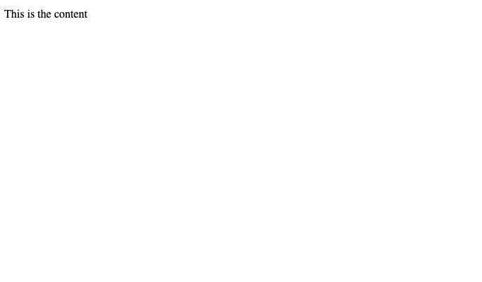
Let's start with some basic HTML of a basic element:
<p id="my-element">
This is the content
</p>
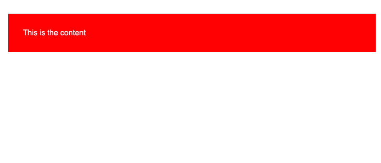
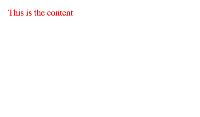
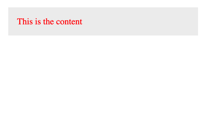
Styling the content
The content in an element can be anything, but in our example our element only has some text in it, for simplicity. Let's style our text to give it a red color and make it slightly bigger:
#my-element{
    color: red;
    font-size: 30px;
}
Styling the padding
Next, let's style the area around the content. Let's increase the padding to 30 pixels and change its background colour to a light grey:
#my-element{
    padding: 30px;
    background-color: lightgrey;
}
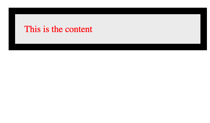
Styling the border
Now, let's style the border of the element. Let's give it a size of 21 pixels and make its color black:
#my-element{
    border: 21px solid black;
}
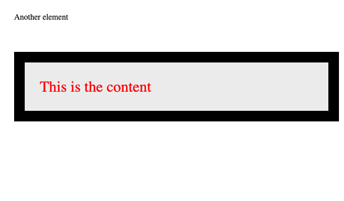
Styling the margin
Finally, let's style the area outside the border. Let's give our element a top margin so that it has a space from the element on top of it of 60 pixels:
#my-element{
    margin-top: 60px;
}
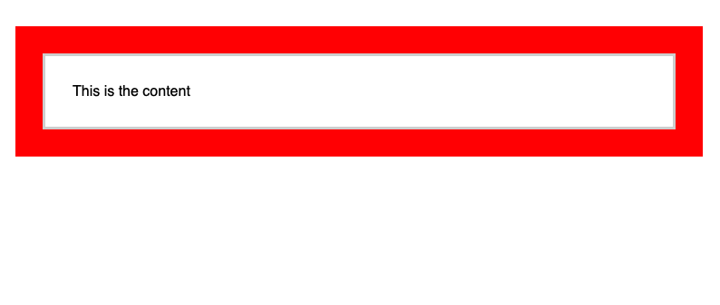
With everything together, this is how our CSS would look like for our element:
#my-element{
/*     Content */
    color: red;
    font-size: 30px;

/*     Padding */
    padding: 30px;
    background-color: #eee;

/*   Border */
    border: 21px solid black;

/*   Margin */
    margin-top: 60px;
}
And this is how the box model makes layouts and styling possible.
More information
To learn more about the box model, check this amazing documentation by the MDN
Dev, Explained (43 part series)
- Javascript Scopes, explained.
- Javascript Promises, explained.
- Accessibility, explained.
- React, explained
- Should I use forEach() or map()?
- Should I use Flexbox or CSS Grid?
- Docker, explained.
- Unit testing, explained
- Git, explained.
- Typescript, explained.
- async/await, explained.
- The DOM, explained.
- Regular expressions, explained
- GraphQL, explained.
- Vue, explained.
- Svelte, explained.
- API, explained.
- Javascript Hoisting, explained.
- Immediately Invoked Function Expressions (IIFE), explained.
- ARIA roles, explained.
- Test-driven Development, explained.
- ARIA live regions, explained.
- aria-label in accessibility, explained.
- Type coercion in Javascript, explained.
- Variables, explained.
- if statements, explained.
- Arrays, explained.
- Currying in Javascript, explained.
- Memoization, explained.
- For loops, explained.
- Javascript Prototypes, explained.
- React Hooks, explained.
- Graph databases, explained.
- MongoDB, explained.
- Serverless, explained.
- Javascript Callback functions, explained.
- HTML, explained.
- CSS, explained.
- Responsive design, explained.
- Javascript, explained.
- The CSS Box Model, explained.
- CSS Flexbox, explained.
- CSS Grid, explained.