Should I use Flexbox or CSS Grid?
Both are tools in CSS that help you take a group of elements and lay them out in specific ways.
So what does each one do and how do they differ?
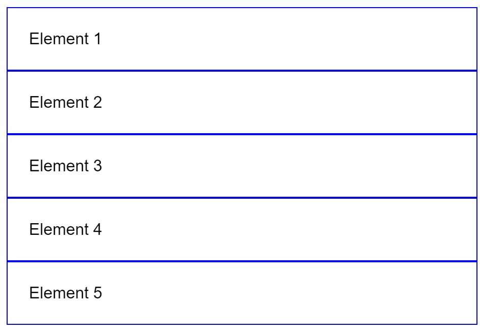
To explain, let's start with a group of 5 elements:
<section>
    <div>Element 1</div>
    <div>Element 2</div>
    <div>Element 3</div>
    <div>Element 4</div>
    <div>Element 5</div>
</section>
As you'd expect, if you run the HTML code above, each element appears below the previous. Like this (some minor styling added for emphasis):
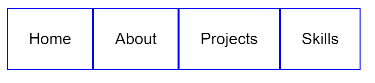
What if you don't want each element to appear one under the other? What if you want to have a navigation bar and you want the elements to appear next to each other?
Like this 👇
Sure there are CSS hacks you could do to make them look how you want them (I'm sure you're thinking of a few right now) but they are all messy and a nightmare to maintain.
This is where Flexbox comes in! 💪
The way it works is pretty simple. Notice how in the HTML code, we have a <section> which includes our 5 elements? 👇
<section>
    <div>Home</div>
    <div>About</div>
    <div>Projects</div>
    <div>Skills</div>
    <div>My CV</div>
</section>
You can style the <section> like this to make it a "Flexbox":
section{
  display: flex;
}
That's it! Now your <div> elements will appear next to each other, just like you want them to!
In essence, a Flexbox puts its elements in a single direction, either horizontally or vertically. Really useful for laying out elements next to each other!
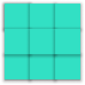
Now say you have a website which has a photo gallery. A cool way to present the photos is in a grid, like this:
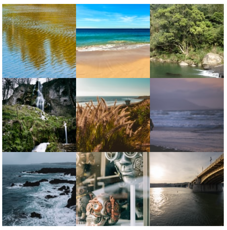
Again, there are several ways to create a grid of photos, a lot of which are messy and clumsy.
So could Flexbox help us with this?
Technically, yes. If we do something like this:
<section>
    <div class="row-divider">
      <img src="img1.png" alt="">
      <img src="img2.png" alt="">
      <img src="img3.png" alt="">
    </div>
    <div class="row-divider">
      <img src="img4.png" alt="">
      <img src="img5.png" alt="">
      <img src="img6.png" alt="">
    </div>
    <div class="row-divider">
      <img src="img7.png" alt="">
      <img src="img8.png" alt="">
      <img src="img9.png" alt="">
    </div>
</section>
Then we can make each row-divider a Flexbox to align our images horizontally:
section .row-divider{
  display: flex;
}
It works! But it doesn't look particularly clean. What if there was a better way? Without needing to have a row divider?
There is! With CSS Grid!
CSS Grid is hands-down the easiest way to create a grid layout. No more row dividers. Just plain HTML and CSS.
So your HTML would simply be this 👇
<section>
    <img src="img1.png" alt="">
    <img src="img2.png" alt="">
    <img src="img3.png" alt="">
    <img src="img4.png" alt="">
    <img src="img5.png" alt="">
    <img src="img6.png" alt="">
    <img src="img7.png" alt="">
    <img src="img8.png" alt="">
    <img src="img9.png" alt="">
</section>
Now if we need to say:
Let's create a grid with 3 columns of equal size
You can do this with 2 CSS statements for your <section>:
section{
  display: grid;
  grid-template-columns: repeat(3, 1fr);
}
That's it!
Flexbox and CSS Grid can greatly improve your workflow and simplify your code!
And that's how the two layouts differ. Thank you for reading! 👋👋

Further info
Printable Flexbox cheatsheet by @Prathkum on Twitter
Printable CSS Grid cheatsheets by @Prathkum on Twitter
Dev, Explained (43 part series)
- Javascript Scopes, explained.
- Javascript Promises, explained.
- Accessibility, explained.
- React, explained
- Should I use forEach() or map()?
- Should I use Flexbox or CSS Grid?
- Docker, explained.
- Unit testing, explained
- Git, explained.
- Typescript, explained.
- async/await, explained.
- The DOM, explained.
- Regular expressions, explained
- GraphQL, explained.
- Vue, explained.
- Svelte, explained.
- API, explained.
- Javascript Hoisting, explained.
- Immediately Invoked Function Expressions (IIFE), explained.
- ARIA roles, explained.
- Test-driven Development, explained.
- ARIA live regions, explained.
- aria-label in accessibility, explained.
- Type coercion in Javascript, explained.
- Variables, explained.
- if statements, explained.
- Arrays, explained.
- Currying in Javascript, explained.
- Memoization, explained.
- For loops, explained.
- Javascript Prototypes, explained.
- React Hooks, explained.
- Graph databases, explained.
- MongoDB, explained.
- Serverless, explained.
- Javascript Callback functions, explained.
- HTML, explained.
- CSS, explained.
- Responsive design, explained.
- Javascript, explained.
- The CSS Box Model, explained.
- CSS Flexbox, explained.
- CSS Grid, explained.