CSS Flexbox, explained.
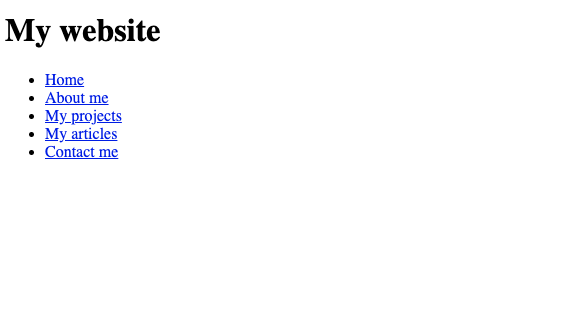
Suppose you create a new web page.
It only contains a heading and 5 link items in a list.
Without any styling, the elements on the page go under each other, as you'd expect.
HTML:
<h1>My website</h1>
<ul>
  <li><a href="#">Home</a></li>
  <li><a href="#">About me</a></li>
  <li><a href="#">My projects</a></li>
  <li><a href="#">My articles</a></li>
  <li><a href="#">Contact me</a></li>
</ul>
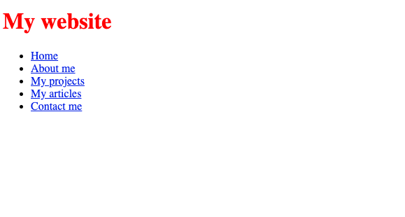
Of course you can style anything on the website, like making the heading colour red:
h1{
  color: red;
}
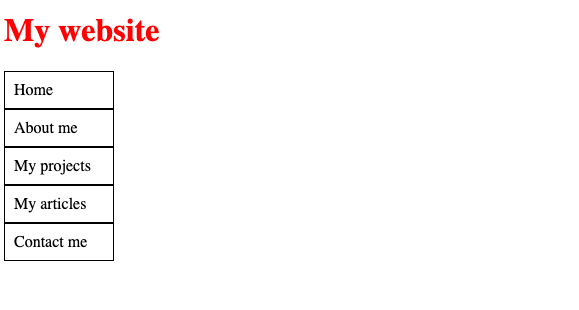
Or making it so it looks like a navigation menu:
ul{
  list-style: none;
  margin: 0;
  padding: 0;
}

ul li a{
  text-decoration: none;
  color: black;
  display: block;
  padding: 9px;
  border: 1px solid black;
  width: 90px;
}
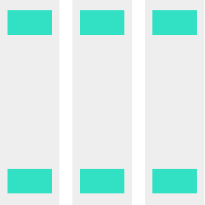
But to really make it look like a navigation, we have to change its style so that the navigation elements are side by side instead of one under the other. How is this possible?
Determining which direction a list of elements should go, either downwards or sideways, can be set by a CSS property called Flexbox!
What is Flexbox?
Flexbox is essentially a way of saying:
I have a bunch of elements, I want to decide whether these elements are shown vertically, or horizontally.
In the case of our navigation elements above, the list items (li) are contained within an "unordered list" element (ul).
Essentially we want to say:
I want the stuff that's in the unordered list element to be horizontal
So we set the styling of the ul to include display: flex:
ul{
  list-style: none;
  margin: 0;
  padding: 0;

  display: flex; /* 👈 "I am now a Flexbox" */
}
The unordered list is now essentially a box with some list items on it.
Now we can specify which direction the items within it should go: row or column:
ul{
  list-style: none;
  margin: 0;
  padding: 0;
  display: flex;
  flex-direction: row; /* 👈 Put items here in a row */
}
Now each item in your navigation will be on a single row.
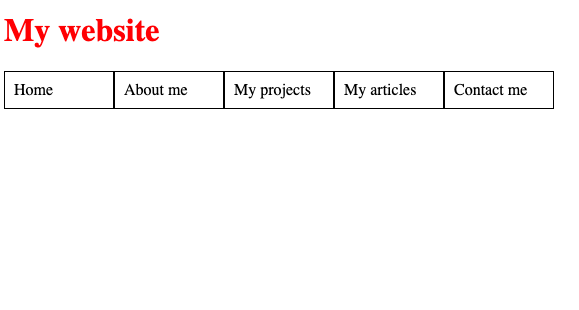
Or if you'd rather have them in a column, use flex-direction: column instead.
So what else can Flexbox do?
Centering a div!
With flexbox, it's easier than ever to center a div!
Suppose you have a div and inside it, a piece of text in another div:
<div class="outer">
  <div class="inner">Some text</div>
</div>
The outer div has a size of 300x120:
.outer{
  border: 6px solid red;
  width: 300px;
  height: 120px;
}
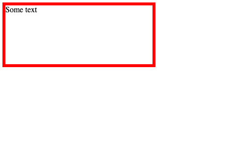
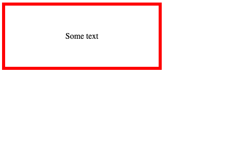
If we want the inner div to be centered, all we need to do is to set the outer div as a flexbox:
.outer{
  border: 6px solid red;
  width: 300px;
  height: 120px;
  display: flex; /* 👈 I am now a flexbox */
}
And set the margin of the inner div as auto:
.inner{
  margin: auto;
}
That's it! Now the text is centered!
More information
To learn more about flexbox, check these resources:
Dev, Explained (43 part series)
- Javascript Scopes, explained.
- Javascript Promises, explained.
- Accessibility, explained.
- React, explained
- Should I use forEach() or map()?
- Should I use Flexbox or CSS Grid?
- Docker, explained.
- Unit testing, explained
- Git, explained.
- Typescript, explained.
- async/await, explained.
- The DOM, explained.
- Regular expressions, explained
- GraphQL, explained.
- Vue, explained.
- Svelte, explained.
- API, explained.
- Javascript Hoisting, explained.
- Immediately Invoked Function Expressions (IIFE), explained.
- ARIA roles, explained.
- Test-driven Development, explained.
- ARIA live regions, explained.
- aria-label in accessibility, explained.
- Type coercion in Javascript, explained.
- Variables, explained.
- if statements, explained.
- Arrays, explained.
- Currying in Javascript, explained.
- Memoization, explained.
- For loops, explained.
- Javascript Prototypes, explained.
- React Hooks, explained.
- Graph databases, explained.
- MongoDB, explained.
- Serverless, explained.
- Javascript Callback functions, explained.
- HTML, explained.
- CSS, explained.
- Responsive design, explained.
- Javascript, explained.
- The CSS Box Model, explained.
- CSS Flexbox, explained.
- CSS Grid, explained.