CSS Grid, explained.
Suppose you are a photographer and you’ve taken some photos you want to show the world.

So you decide to learn HTML and CSS so can create a website with all your photos.
It takes you a bit of time but eventually you manage to upload all your photos for everyone to see!
By default, a browser displays all elements one under the other. Your website is no exception.

It’s great that you have a place to show off your work, but the website doesn’t quite look right. You want it to look less than a long document, and more like a gallery of photos!
Essentially you want all your photos to be shown in rows and columns, like a grid. How can you do that?
This is where CSS Grid comes in!
Now suppose this is the HTML you created to place your photos:
<div id="myphotos">
    <img src="photo01.jpg" alt="">
    <img src="photo02.jpg" alt="">
    <img src="photo03.jpg" alt="">
    <img src="photo04.jpg" alt="">
    <img src="photo05.jpg" alt="">
    <img src="photo06.jpg" alt="">
    <img src="photo07.jpg" alt="">
    <img src="photo08.jpg" alt="">
    <img src="photo09.jpg" alt="">
</div>
It’s basically a div called myphotos with some images. As we saw, by default, the images are displayed one under the other. We want to display these photos as a grid. Here’s how.
First, in CSS, we set the “myphotos” div to display: grid:
#myphotos{
    display: grid;
}
Next we’re going to tell our browser that we need a grid made up of 3 columns:
#myphotos{
    display: grid;
    grid-template-columns: repeat(3, 1fr);
}
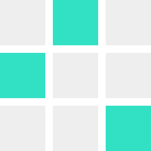
Now our photo gallery actually looks like a gallery!

As a last step to finalise our gallery, we can add some space between our photos by using grid-gap in CSS:
#myphotos{
    display: grid;
    grid-template-columns: repeat(3, 1fr);
    grid-gap: 15px;
}
Now it looks even more like a gallery!

This is essentially what CSS Grid lets us do. It lets us define columns and rows so we can organise elements in a grid. It works for every element, not just photos!
CSS Grid works best in larger displays so to find out more about how to accommodate for different screen sizes, see:
Next steps
Now that you got a good first idea of what a grid is, these will get you up to speed:
A Complete Guide to Grid - CSS Tricks
CSS Grid Layout - MDN
CSS Grid Layout Crash Course - Traversy Media on YouTube
Dev, Explained (43 part series)
- Javascript Scopes, explained.
- Javascript Promises, explained.
- Accessibility, explained.
- React, explained
- Should I use forEach() or map()?
- Should I use Flexbox or CSS Grid?
- Docker, explained.
- Unit testing, explained
- Git, explained.
- Typescript, explained.
- async/await, explained.
- The DOM, explained.
- Regular expressions, explained
- GraphQL, explained.
- Vue, explained.
- Svelte, explained.
- API, explained.
- Javascript Hoisting, explained.
- Immediately Invoked Function Expressions (IIFE), explained.
- ARIA roles, explained.
- Test-driven Development, explained.
- ARIA live regions, explained.
- aria-label in accessibility, explained.
- Type coercion in Javascript, explained.
- Variables, explained.
- if statements, explained.
- Arrays, explained.
- Currying in Javascript, explained.
- Memoization, explained.
- For loops, explained.
- Javascript Prototypes, explained.
- React Hooks, explained.
- Graph databases, explained.
- MongoDB, explained.
- Serverless, explained.
- Javascript Callback functions, explained.
- HTML, explained.
- CSS, explained.
- Responsive design, explained.
- Javascript, explained.
- The CSS Box Model, explained.
- CSS Flexbox, explained.
- CSS Grid, explained.