Website review #6 - Agathe Badia
Introduction
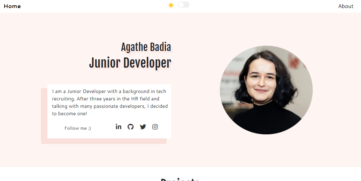
A few days ago I posted a tweet asking for followers' websites for me to review on my website. Agathe responded with hers.
So, here's her website, and here's the review.
🚨 This is the 6th review I'm doing here. See here for more reviews.
The good
Light/dark mode switch
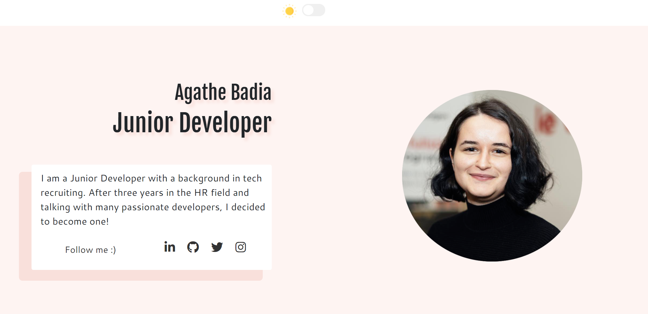
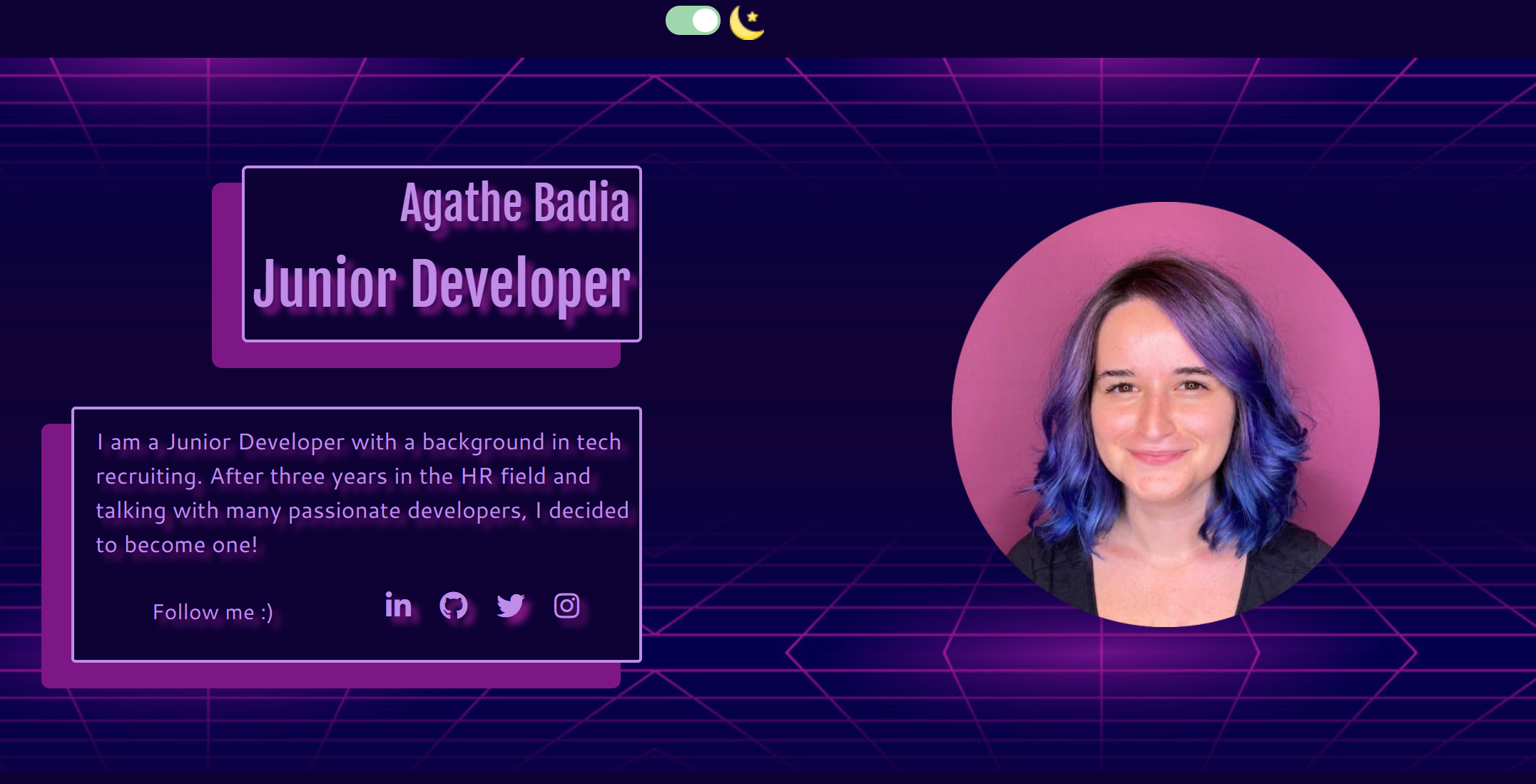
One of the first things that my eyes looked when visiting Agathe's website was the dark/light mode switch. The implementation of it is pretty awesome. Not only does the website change colours, the author's photo changes to match. I don't think I've seen this before and I think it's pretty creative.
Light theme:
Dark theme:
Accessibility wins
Full keyboard access
As a test, I've tried to browse the website without using a mouse. Agathe's website is fully accessible with a keyboard!
Good contrast
Agathe has chosen great colour schemes for both light and dark theme, which isn't an easy thing to do, with great contrast between text and background overall.
About page Skills section
While browsing around Agathe's website, the thing that amazed me the most was the Skills section in the About page.
Why? I've visited countless portfolios and almost all of them have a list of tools and languages. Agathe, instead, describes how she has helped people using her skills.
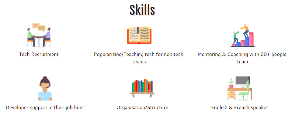
Yes, her tech stack is still there but it's anything but long and exhaustive.
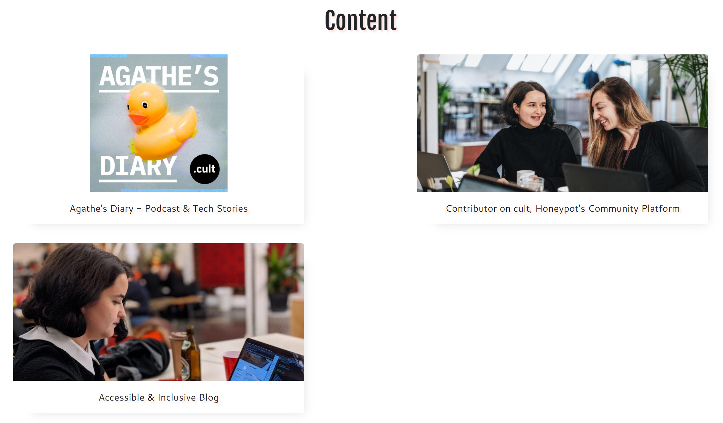
Great thumbnails and photos
I really like how Agathe has put herself in a lot of the thumbnails instead of some generic stock photos or icons.
Suggestions for improvement
Doesn't run without Javascript
This is what the website looks with Javascript disabled:

Nothing can be opened without Javascript. This is usually not such a big deal, but this could be grounds for improvement in performance and accessibility.
Accessibility improvements
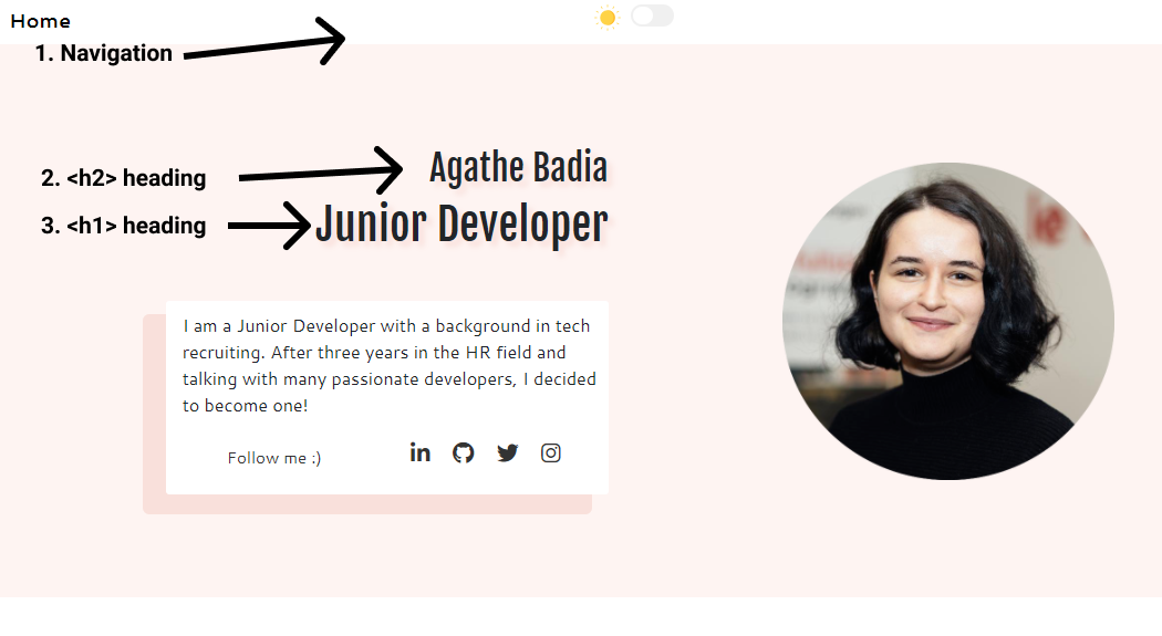
Element order
The order of elements on the website could be switched to avoid confusion. It starts with a navigation element, followed by an <h2> tag, followed by an <h1> tag. It could include a <header> tag to include the website's name and navigation and it's best if the page starts with a <h1> tag, instead of an <h2> followed by an <h1>.
Page titles
This website has two internal pages: Home and About. Both these pages have a title of "Welcome!".
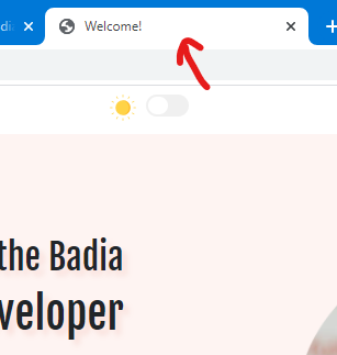
For better accessibility, the About page should have its own title, "About" would do.
Social media icons
Agathe's social media icons at the footer are retrieved from FontAwesome. The code snippets provided to add the icons to your pages aren't accessible out of the box because they don't have labels for screen readers.
For example for the icon for Facebook, you can include this:
<a href="https://facebook.com/mypage">
  <i class="fab fa-facebook-f"></i>
</a>
Nice and easy but screen readers have no idea what to read to the user. FontAwesome has a handly accessibility guide on how to fix this. So the code above would look like this:
<a href="https://facebook.com/mypage" aria-label="Go to my Facebook page">
  <i class="fab fa-facebook-f" aria-hidden="true"></i>
</a>
Now the screen reader would read "Go to my Facebook page"!
Conclusion
Agathe has done an amazing job implementing light/dark mode switches with some great accessible colour schemes, and an nice Skills section. I would like to see it working better with Javascript and some very minor tweaks could take this site to the next level, accessibility-wise.
Score: 8.5/10
Reviews (14 part series)
- Website review #1 - Cadejo.Dev (Vinicio Vladimir Sánchez Trejo)
- Website review #2 - Concrete and Lavender (Maria Spyrou)
- Website review #3 - Twitter Butler Digest
- Website review #4 - Coding with Ease (Godspower Eze)
- Website review #5 - Catalin Pit
- Website review #6 - Agathe Badia
- Website review #7 - DenisWritesCode (Denis Mutinda)
- Website review #8 - Timothy Adeyeye
- Website review #9 - Fauzi Arda
- Website review #10 - Tech Stack Banner (Andy Griffiths)
- Website review #11 - Baljeet Singh
- Website review #12 - Gabriel Lazcano
- Website Review #13 - SoftWar by RepublicOf1 (Benjamin Green)
- Website review #14 - Randy Davoh
