
Website review #11 - Baljeet Singh
Introduction
Baljeet has submitted his website for a review last March as a response to my tweet I posted back then.
So this is my review.
The good
A clean and straight-forward layout
Baljeet has created a website where everything is easily reachable. From his articles, to his courses and contact form. Everything can be found very easily!
Works without Javascript!
As a test, I've turned off Javascript in Chrome. The fact that it works flawlessly without Javascript enabled is a massive win in my book. Good job Baljeet!
Articles and courses easy to reach
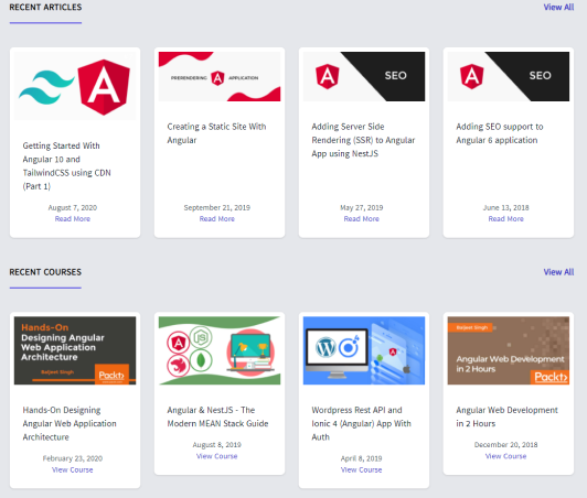
Baljeet has written some articles and made several courses. All are a scroll away at the home page and also using the navigation.
Good responsiveness
Baljeet's website is highly responsive and can be easily navigated on phones!
Fully keyboard accessible!
Every single part of the website can be easily accessible without using a mouse, with just a keyboard. This is a massive win for accessibility for Baljeet's website. Kudos!
Suggestions for improvement
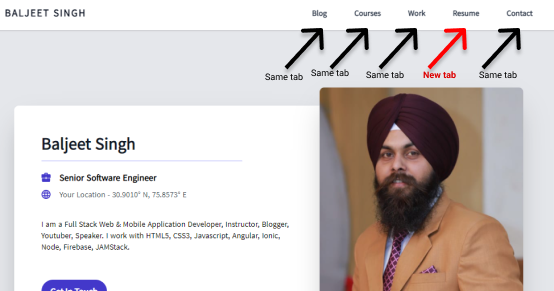
Confusing header navigation
The navigation links don't all open in the same tab. The "Resume" tab opens in a new tab since it's a PDF document. It better belongs outside the main navigation since the visitors expect all pages to open in the same tab and website layout.
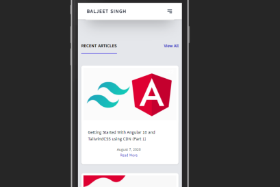
Some odd behaviour on mobile
For some odd reason, the photo on the front page of the website doesn't seem to show up on mobile. Not sure why or if it's intentional (doesn't seem to be).
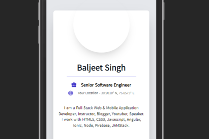
Might need to look into this.
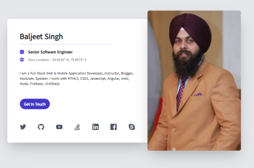
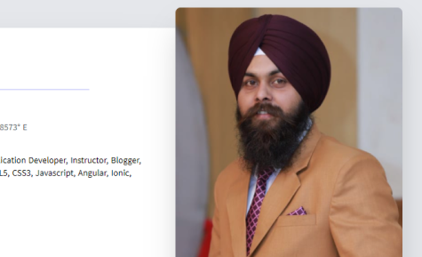
Photo needs an alt text
The photo of the developer on the front page is a great addition and adds a friendly face to the website. However, an alt text is required. I would suggest an empty alt="" text since it's purely decorative and serves no purpose to the screen reader user.
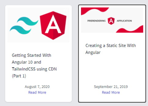
Images that should be code blocks
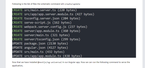
I've visited some of Baljeet's blog posts. They are great posts, but something I would change would be some of the images that should be code blocks. Use <pre> and <code> tags for better accessibility of code and output segments:
<pre>
    <code>
        Your code segment goes here
    </code>
</pre>
Conclusion
Baljeet has put a lot of effort into create a simple and effective website and it shows. Everything is a click/tap away. His articles could use a bit of refinement, such as avoid adding code blocks as images.
Score: 7/10
Reviews (14 part series)
- Website review #1 - Cadejo.Dev (Vinicio Vladimir Sánchez Trejo)
- Website review #2 - Concrete and Lavender (Maria Spyrou)
- Website review #3 - Twitter Butler Digest
- Website review #4 - Coding with Ease (Godspower Eze)
- Website review #5 - Catalin Pit
- Website review #6 - Agathe Badia
- Website review #7 - DenisWritesCode (Denis Mutinda)
- Website review #8 - Timothy Adeyeye
- Website review #9 - Fauzi Arda
- Website review #10 - Tech Stack Banner (Andy Griffiths)
- Website review #11 - Baljeet Singh
- Website review #12 - Gabriel Lazcano
- Website Review #13 - SoftWar by RepublicOf1 (Benjamin Green)
- Website review #14 - Randy Davoh