Website review #2 - Concrete and Lavender (Maria Spyrou)
Introduction
When I posted the tweet asking for followers' websites to review, Maria replied soon after. This is her website. Thank you Maria for your submission!
Let's review!
The good
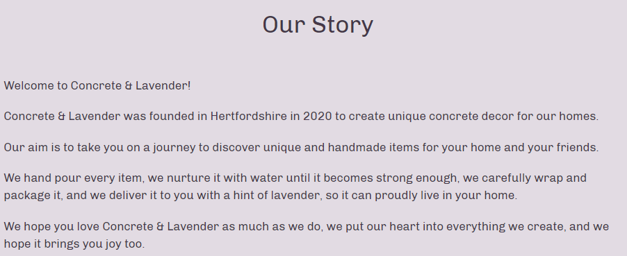
Our story page
An About (or Our Story) page is always a good idea, especially if you're promoting a business. It makes you friendly and approachable. The text itself gives the impression that Maria cares deeply about her products and her customers. Well written!
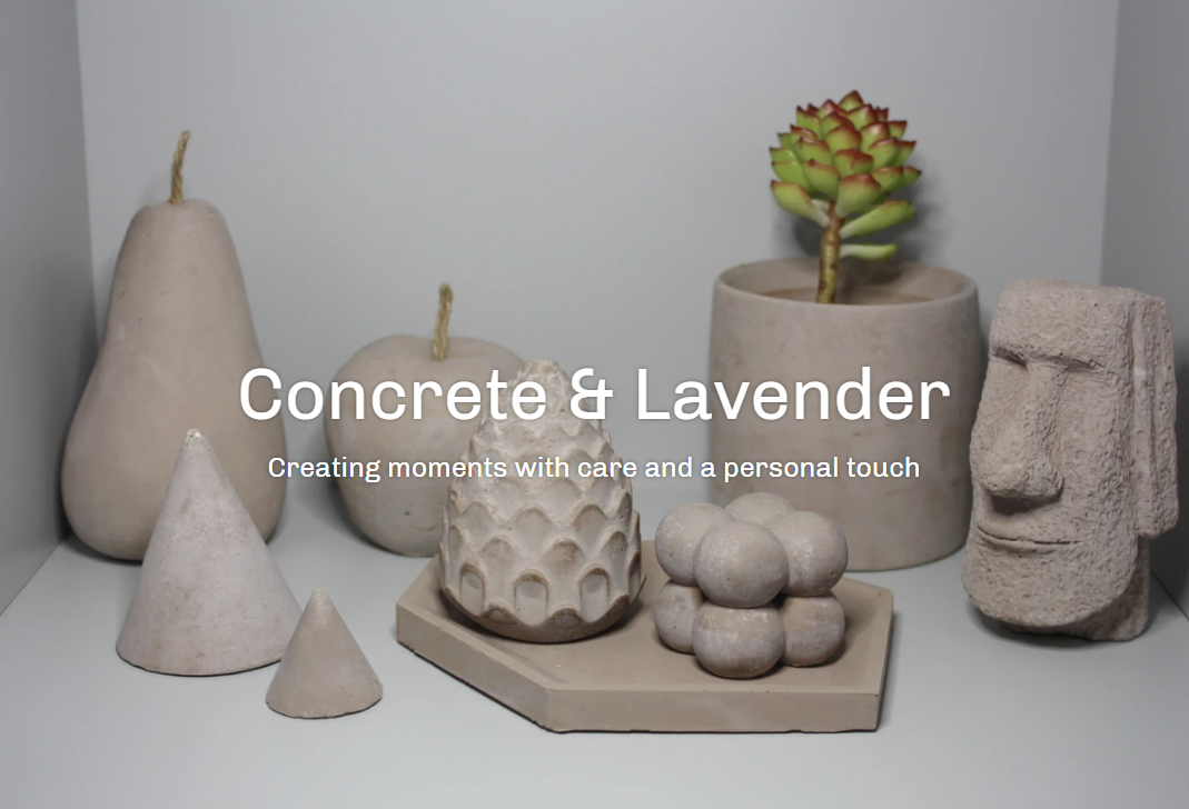
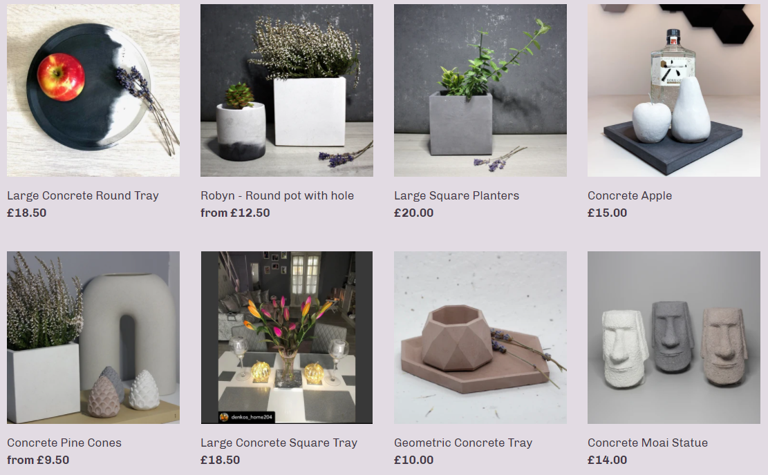
Products take center stage
What better way to present your products than to remove any unnecessary clutter and let your products shine on your website?
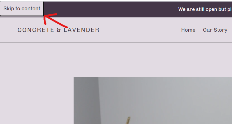
Good keyboard navigation
Being able to access a website with only the keyboard is crucial for accessibility. And Concrete and Lavender delivers. Not only is this website fully accessible with a keyboard, it also includes a "Skip to content" link. Nice!
Works well without Javascript
Another great thing is that the website runs without Javascript with (mostly) no problems. The only thing that wasn't working was the filter dropdowns.
Improvements
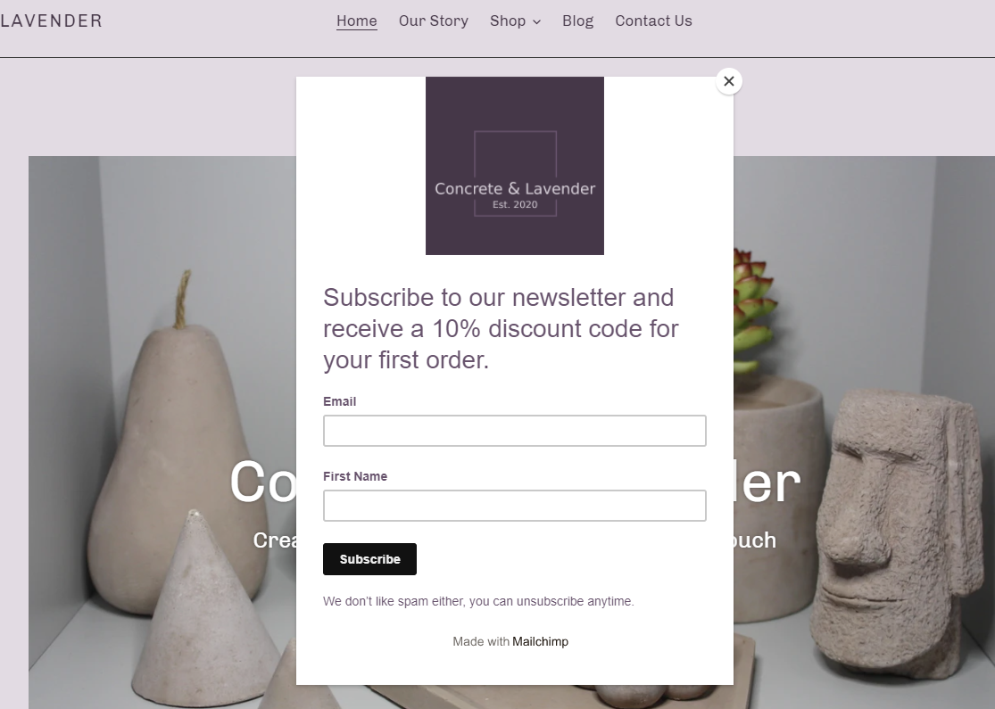
Newsletter popup
As soon as you enter the website, you're presented with a popup asking you to sign up to the newsletter. Popups are rarely a welcome addition, especially once you enter a website. A more subtle approach such as a form at the bottom of the page would be less intrusive.
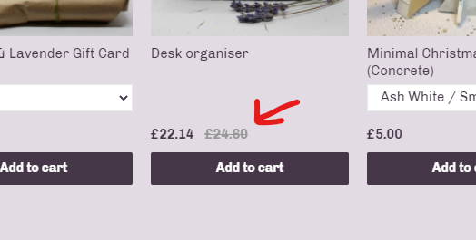
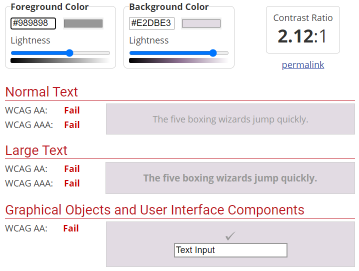
Contrast on crossed-out prices
The cross-out prices gives a good indication of "before and after" price offers, but there is a contrast issue between the background colour and the text colour:
This is what the Web AIM Contrast Checker shows:
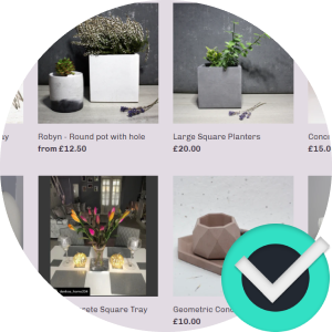
Links without discernible text
Another accessibility issue is with the images on the Recently Added Products section.
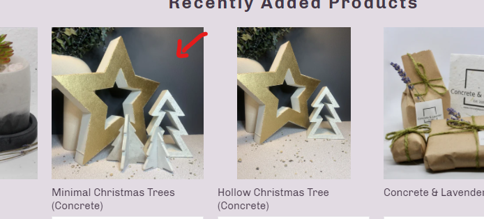
They are basically links (<a>) with a <div> inside them that have the thumbnail as a background image. This means that the link doesn't have any text, which can be confusing for screen reader users. This could be remedied by having only one <a> link per product which wraps the thumbnail and the title.
Conclusion
An overall great and welcoming e-commerce website. Definitely welcoming to the user that clearly shows the love the owner puts in her products. The newsletter popup might be a bit intrusive however.
Reviews (14 part series)
- Website review #1 - Cadejo.Dev (Vinicio Vladimir Sánchez Trejo)
- Website review #2 - Concrete and Lavender (Maria Spyrou)
- Website review #3 - Twitter Butler Digest
- Website review #4 - Coding with Ease (Godspower Eze)
- Website review #5 - Catalin Pit
- Website review #6 - Agathe Badia
- Website review #7 - DenisWritesCode (Denis Mutinda)
- Website review #8 - Timothy Adeyeye
- Website review #9 - Fauzi Arda
- Website review #10 - Tech Stack Banner (Andy Griffiths)
- Website review #11 - Baljeet Singh
- Website review #12 - Gabriel Lazcano
- Website Review #13 - SoftWar by RepublicOf1 (Benjamin Green)
- Website review #14 - Randy Davoh