
Website review #5 - Catalin Pit
Introduction
Last Friday, I've posted a tweet asking a simple thing: Paste a link to your website or blog and I will post a review about it. Many replied, among them, Catalin Pit who I am a big fan of his work, both on Twitter and YouTube. He has submitted his blog for a review. So here it is.
🚨 This is the 5th review I'm doing. Check the reviews section for more reviews of websites submitted by followers.
The Good
The Standard Hashnode Quality
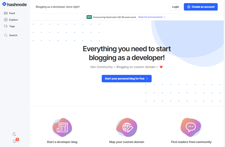
Hashnode is becoming the standard for setting up a blog in no-time as a developer. And why wouldn't you go for Hashnode? It has some amazing features built-in so you can focus more on your writing and less on building the site. Here are a few which are also part of Catalin's blog:
Following: If you like a blog you can sign in to Hashnode and follow their work, or subscribe to their newsletter
X minute read: Easily see how much time you'll spend reading the article before clicking it
Viewcount: See how popular an article is with the simple view count.
Post reactions: One of the best features is the reactions pane on the side of each article. Makes for a fun experience!
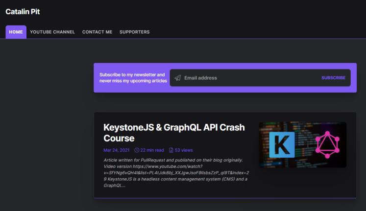
Amazing thumbnails
Catalin's blog has some of the best thumbnails I've seen. Instead of using standard stock photos or icons, Catalin is enforcing his "brand" by creating customised thumbnails which extend to his YouTube channel. Amazing work which makes the post previews more inviting to click.
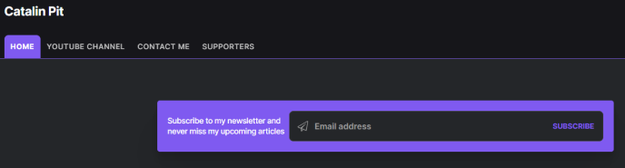
Colour scheme
Catalin also has one of the most beautiful colour schemes among Hashnode blogs. Using the same blogging platform can lead to repetitive designs, but Catalin has found a way to stand out.
Suggestions for improvement
Confusing tabs
Tabs allow for straight-forward navigation on a website. However, there is a user expectation, which is that all the links in the navigation lead to a part of the website, not an external page. Catalin's website has a link on the header navigation which points to his YouTube channel. Although this adds visibility to his channel, it might confuse users who expect to stay on the site when clicking on the links.
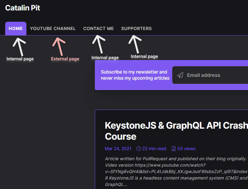
Maybe the YouTube link is better suited on the right side with the other social media links.
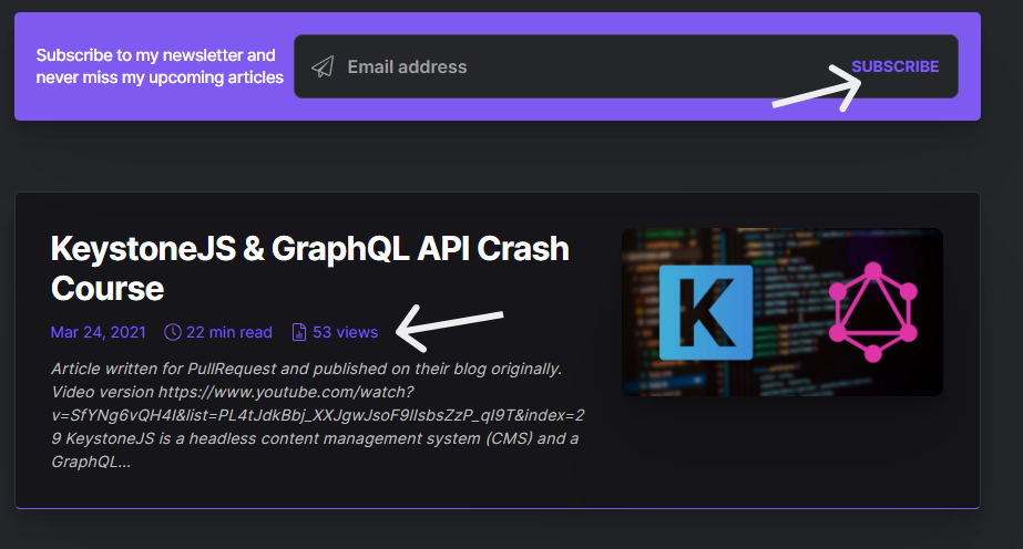
Contrast issues
I have praised Catalin's colour scheme earlier, however on occasion, the contrast between the text and the background is insufficient, especially for purple text on black (or very dark grey) background.
This is what WebAIM has to say about this:
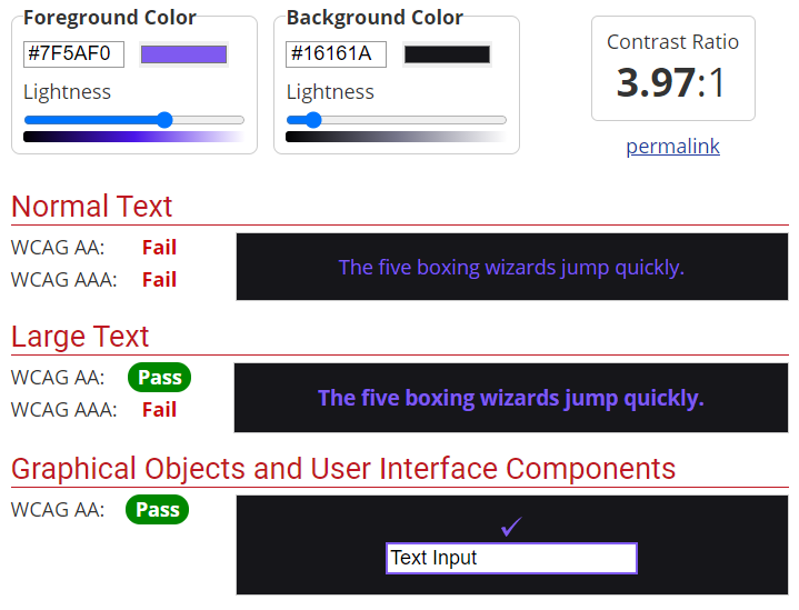
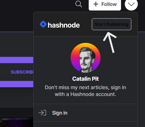
There's also the issue with the "Start Publishing" button which is practically invisible.
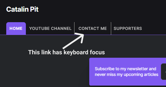
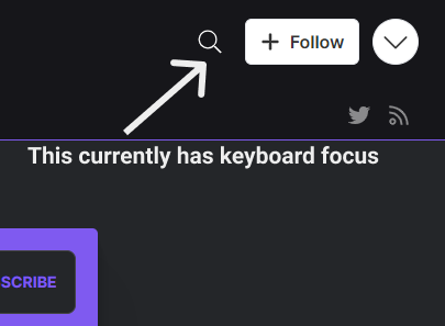
Keyboard navigation
Although every part of the website can be accessed with a keyboard, this could be improved to have a more prominent border on focus when navigating with the Tab button.
Conclusion
Catalin's blog is well worth a visit with some inviting thumbnails and a great colour scheme, all with the standard quality that a Hashnode blog has to offer. However, some parts might cause confusion and some accessibility concerns.
Score: 8/10
Reviews (14 part series)
- Website review #1 - Cadejo.Dev (Vinicio Vladimir Sánchez Trejo)
- Website review #2 - Concrete and Lavender (Maria Spyrou)
- Website review #3 - Twitter Butler Digest
- Website review #4 - Coding with Ease (Godspower Eze)
- Website review #5 - Catalin Pit
- Website review #6 - Agathe Badia
- Website review #7 - DenisWritesCode (Denis Mutinda)
- Website review #8 - Timothy Adeyeye
- Website review #9 - Fauzi Arda
- Website review #10 - Tech Stack Banner (Andy Griffiths)
- Website review #11 - Baljeet Singh
- Website review #12 - Gabriel Lazcano
- Website Review #13 - SoftWar by RepublicOf1 (Benjamin Green)
- Website review #14 - Randy Davoh