Website review #4 - Coding with Ease (Godspower Eze)
Introduction
When Godspower replied to my tweet with his own website, the first thing that intrigued me was the site's name: Coding With Ease. That got my curiosity to explore further.
So here's the review.
The Good
Delivering on making code easy
The website's name, Coding with Ease isn't just a gimmick to make you click on the website. Godspower really puts thought into his articles to make them understandable, especially for complex topics like Blockchain and Data types. Absolutely worth a read.
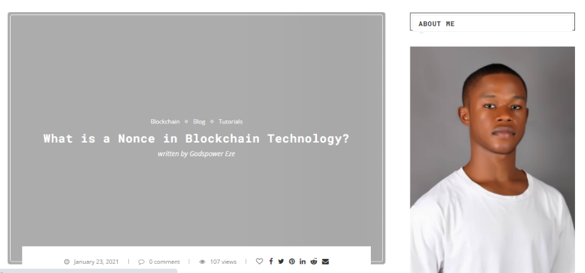
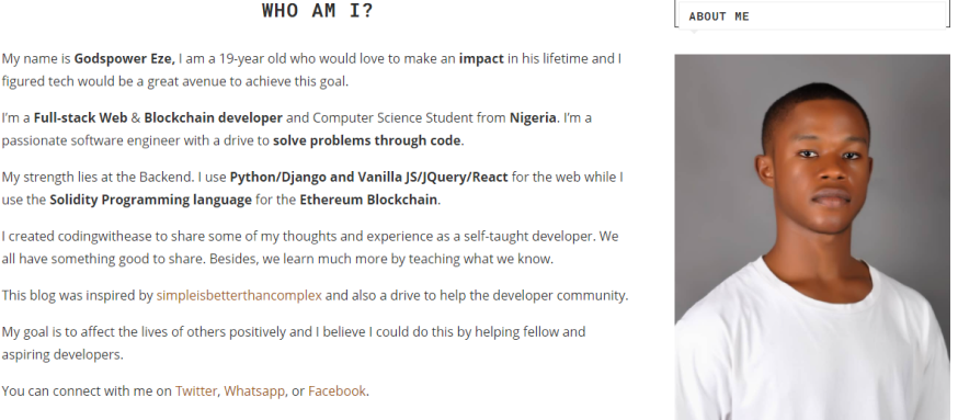
About Me section and Who Am I section
A tech blog sounds like a dull and technical place to visit, and a page about the author of the website always makes it more personal and approachable. In the Who am I section, Godspower tells the story of behind the blog, his inspiration and his skills without overwhealming us with unnecessary details.
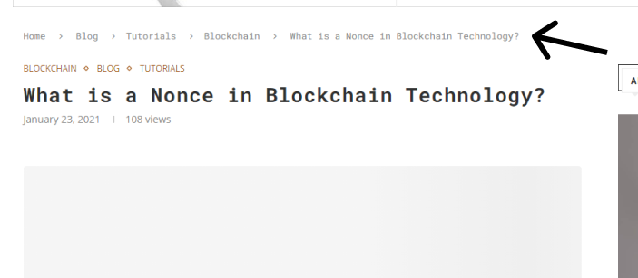
Breadcrumbs
Another welcome addition to the Coding With Ease blog are the breadcrumbs. It always makes navigating the website easier and more accessible.
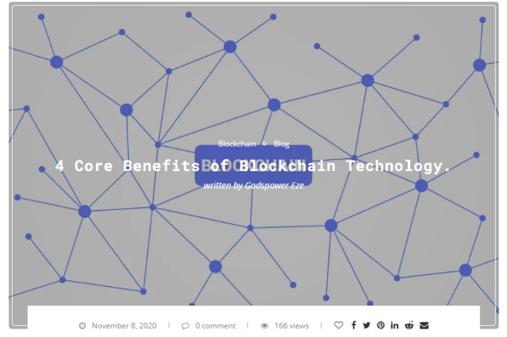
Large thumbnails help content take center stage
Visuals are much better than text to convey an idea. Large thumbnails for post lists are inviting to the visitor to click to learn more. Good choice!
Suggestions for improvement
Popups
Once you enter the website for the first time you are immediately greeted by a popup asking you to subscribe to the site's newsletter.
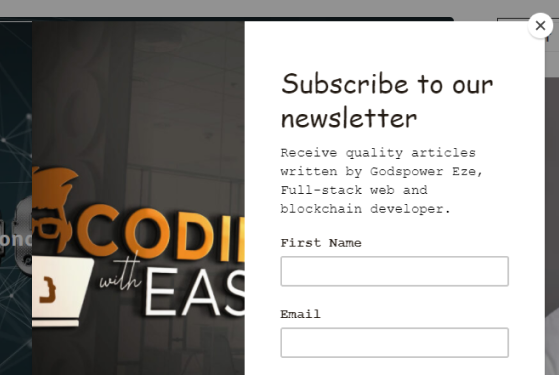
While a newsletter is a great way for your visitors to follow your posts and updates, having a popup for it upon first entry can be an annoying intrusion. It is best to let your visitor browse around and decide for themselves whether they want to sign up to your newsletter. The Subscribe form at the bottom is more than enough.
Text in front of images
On the front page, the list of posts is basically the thumbnail with the text in front of it. This sometimes makes the text unreadable, even if hovering over the thumbnail reduces the brightness of the background.
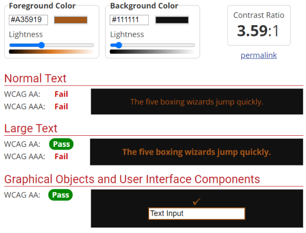
Contrast
Some text on the site has insufficient contrast against its background. For example:
There is a dark orange link on a dark grey background

And this is what the Web AIM Contrast Checker says:
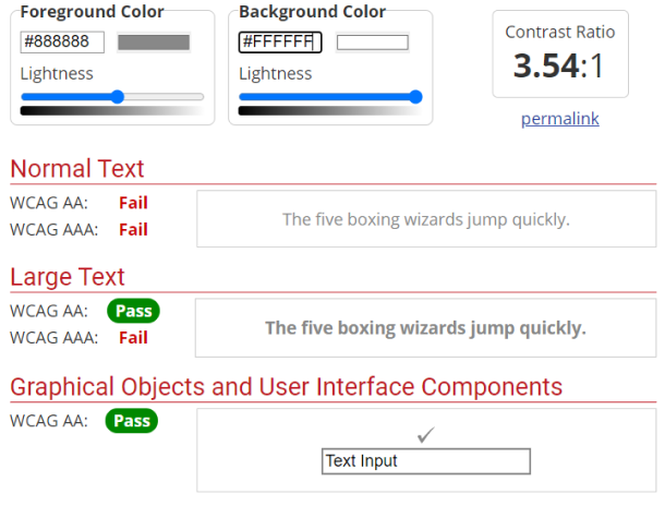
Also the breadcrumbs have light grey text on a white background:
Share icons text
Each post in the post list has a nice set of icons provided by FontAwesome to share the article. However, screen readers can't read these icons because it doesn't have any text to read. aria-label can help with this. See how to make your FontAwesome icons accessible.
Conclusion
Overall a good and inviting website that delivers on its "coding with ease" promise. Some text is hard to read and popups could be reduced.
Score: 7/10
Reviews (14 part series)
- Website review #1 - Cadejo.Dev (Vinicio Vladimir Sánchez Trejo)
- Website review #2 - Concrete and Lavender (Maria Spyrou)
- Website review #3 - Twitter Butler Digest
- Website review #4 - Coding with Ease (Godspower Eze)
- Website review #5 - Catalin Pit
- Website review #6 - Agathe Badia
- Website review #7 - DenisWritesCode (Denis Mutinda)
- Website review #8 - Timothy Adeyeye
- Website review #9 - Fauzi Arda
- Website review #10 - Tech Stack Banner (Andy Griffiths)
- Website review #11 - Baljeet Singh
- Website review #12 - Gabriel Lazcano
- Website Review #13 - SoftWar by RepublicOf1 (Benjamin Green)
- Website review #14 - Randy Davoh