Website Review #13 - SoftWar by RepublicOf1 (Benjamin Green)
Introduction
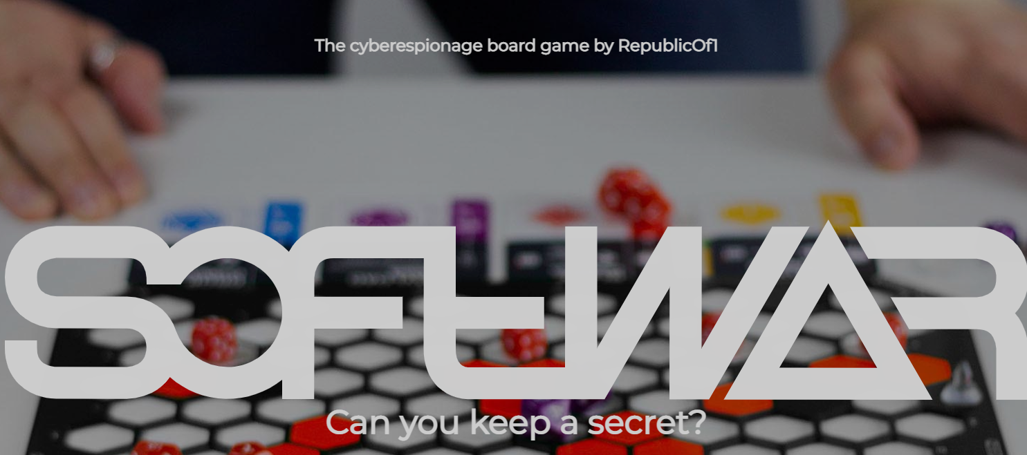
Benjamin Green (aka RepublicOf1) has created a board game called SoftWar. It's a game that shows his overall passion for board games. Benjamin has submitted the website he put together for the game for a review last March.
So here it is!
For more reviews of followers' website, see the Reviews section.
The Good
Storyline
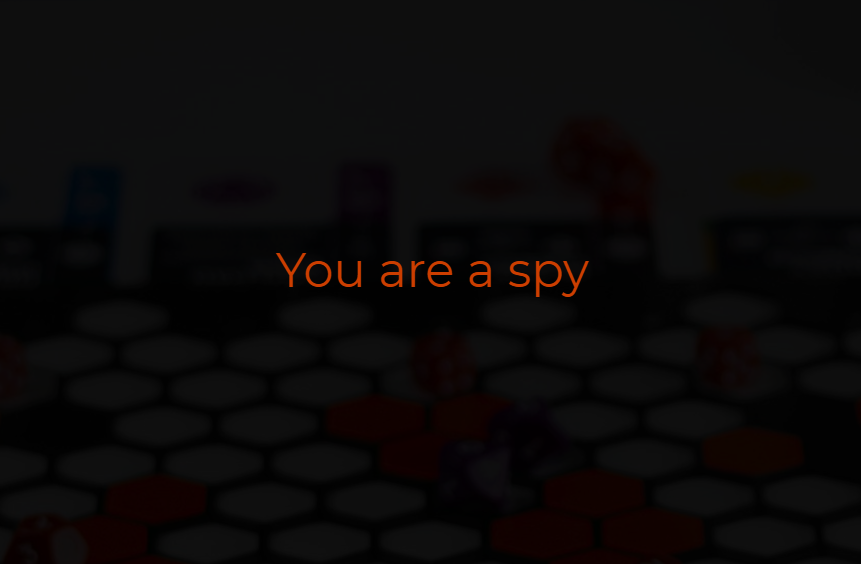
Behind every board game is an interesting story. A story that can be used as a selling point for the game. The SoftWar website does a great job at presenting the story to the visitor who came to see what the game is about. Good job!
Creative usage of scrolling
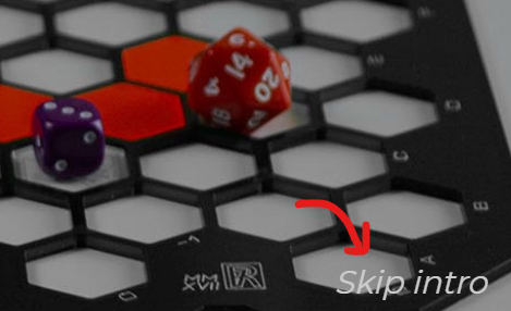
I'm not a fan of scroll-jacking. At all. I believe it adds nothing to the website other than confusing your user. But something about this makes me not mind it. Maybe it's the story the site is trying to tell. Anyway, if you don't fancy it, the Skip Intro button is a thoughtful addition for those who don't want to put up with it.
Keyboard accessible
I'm not going to lie. This caught me a bit by surprise. With all its complex user experience, this site is fully accessible with a keyboard. Nice!
Responsive
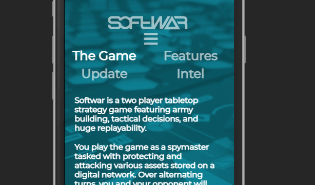
The website is fully responsive with no compromises to usability!
Suggestions for improvement
Flashing
As much as it's appealing to use fancy animations and fade in/out effects, an excess of it can have a negative effect on usability. The SoftWar pages is such an example. The story is great yes, and the usage of scrolling is creative. But the flip side of it is the flashing and sudden colour changes that happen while browsing through the pages.
Note: The below video contains flashing animations
I found myself more than once looking away from my screen.
Hard to read text
Text on a photo background is quite a common theme on SoftWar pages.
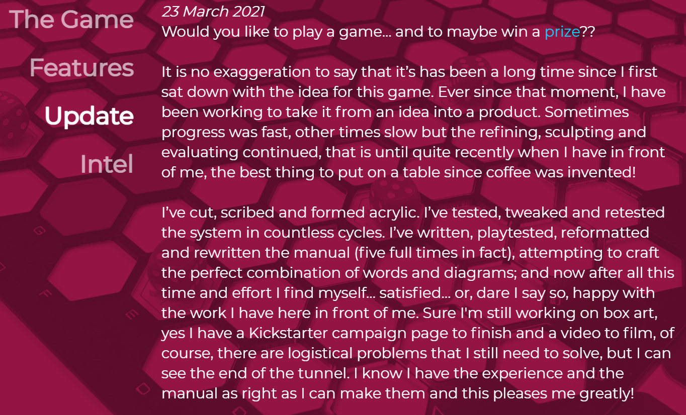
This juxtaposition makes the text hard to read, on some pages more so than others. Personally, I would remove the background as it makes the text more readable and it adds nothing to the page.
Contrast issues
Further from the text on a photo background, there are some contrast issues throughout.
For example, the "Introduction" menu item:
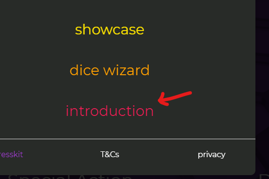
has a contrast ratio of 3.09:1, not sufficient according to WebAIM.
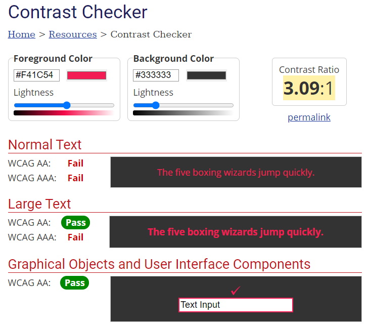
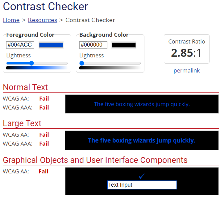
Another example is within the Introduction:

The "An operator in Electronics…" text is dark blue on a black background and has a contrast ratio of 2.85:1, which is extremely low.
Confusing navigation
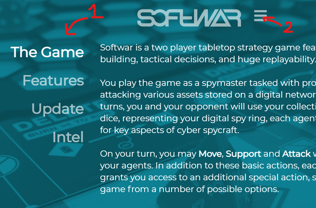
A final point is top navigation of the website.
Basically it contains two different navigations. This can be quite confusing and needlessly overcomplicating the usability of a website.
Conclusion
This is a website which shows Benjamin's passion for board games and the storytelling it can tell. Some over-the-top effects and animations could affect the usability and accessibility of the website negatively.
Score: 7/10
Reviews (14 part series)
- Website review #1 - Cadejo.Dev (Vinicio Vladimir Sánchez Trejo)
- Website review #2 - Concrete and Lavender (Maria Spyrou)
- Website review #3 - Twitter Butler Digest
- Website review #4 - Coding with Ease (Godspower Eze)
- Website review #5 - Catalin Pit
- Website review #6 - Agathe Badia
- Website review #7 - DenisWritesCode (Denis Mutinda)
- Website review #8 - Timothy Adeyeye
- Website review #9 - Fauzi Arda
- Website review #10 - Tech Stack Banner (Andy Griffiths)
- Website review #11 - Baljeet Singh
- Website review #12 - Gabriel Lazcano
- Website Review #13 - SoftWar by RepublicOf1 (Benjamin Green)
- Website review #14 - Randy Davoh
