
Website review #14 - Randy Davoh
Introduction
It's been since October that Randy has asked for my review of his website, after I have asked for submissions on Twitter. A few things came up in the meantime, but here it is. Sorry it took 4 months Randy 😆
The good
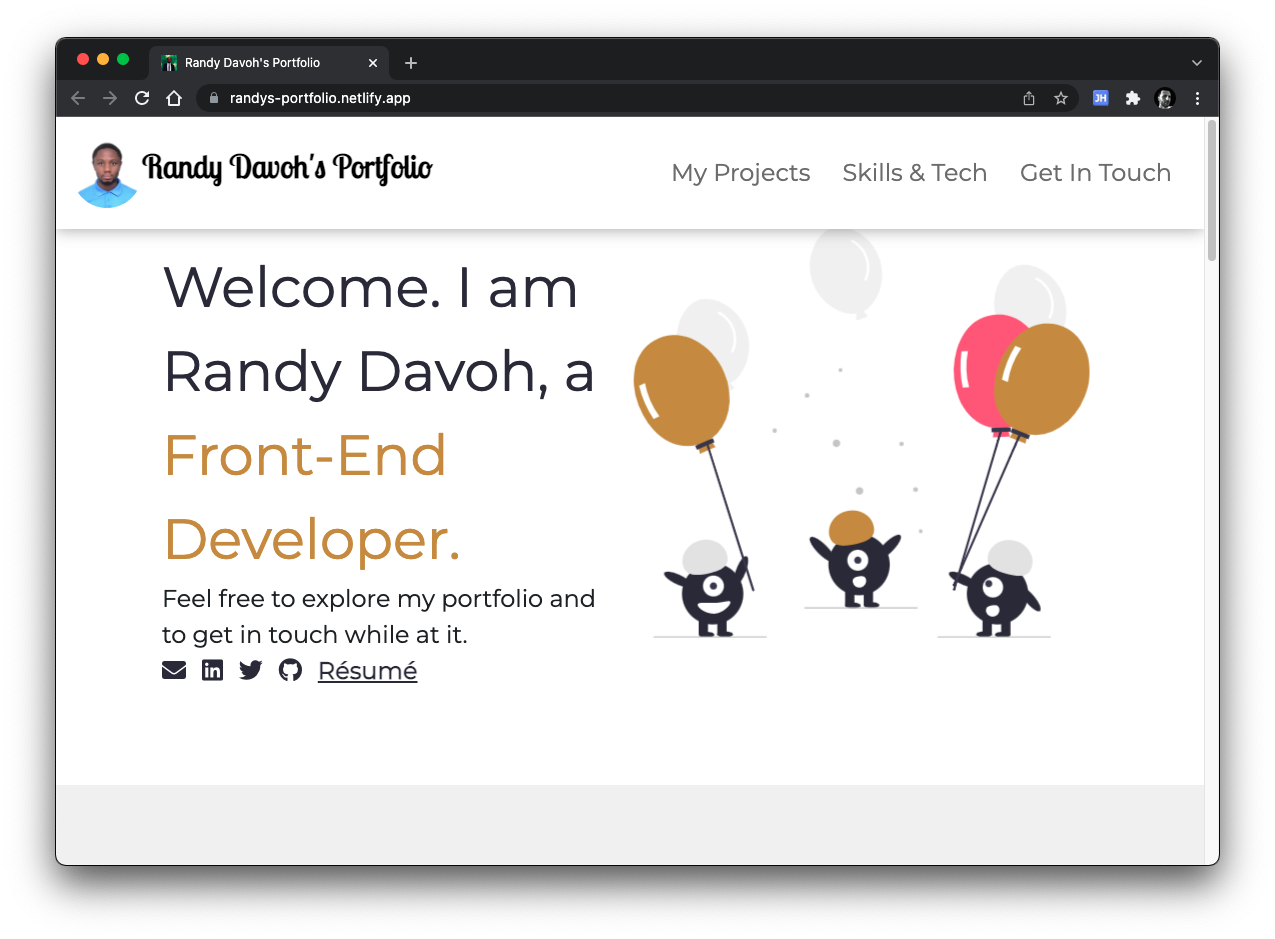
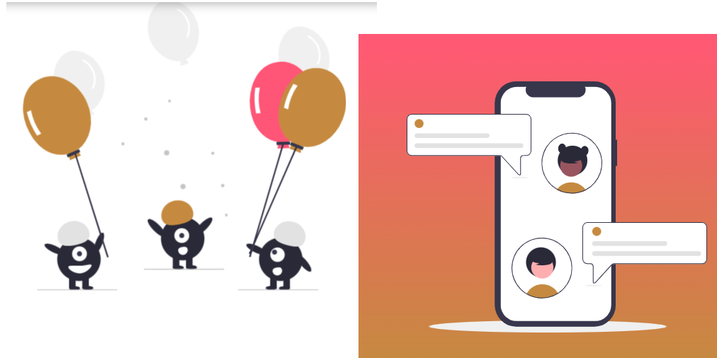
Nice graphics
I'm not too sure if the graphics featured in his website are his own, but they definitely compliment his portfolio website nicely. From the baloon carrying blobs at the top to the phone message illustrations at the bottom of the page.
My Projects section
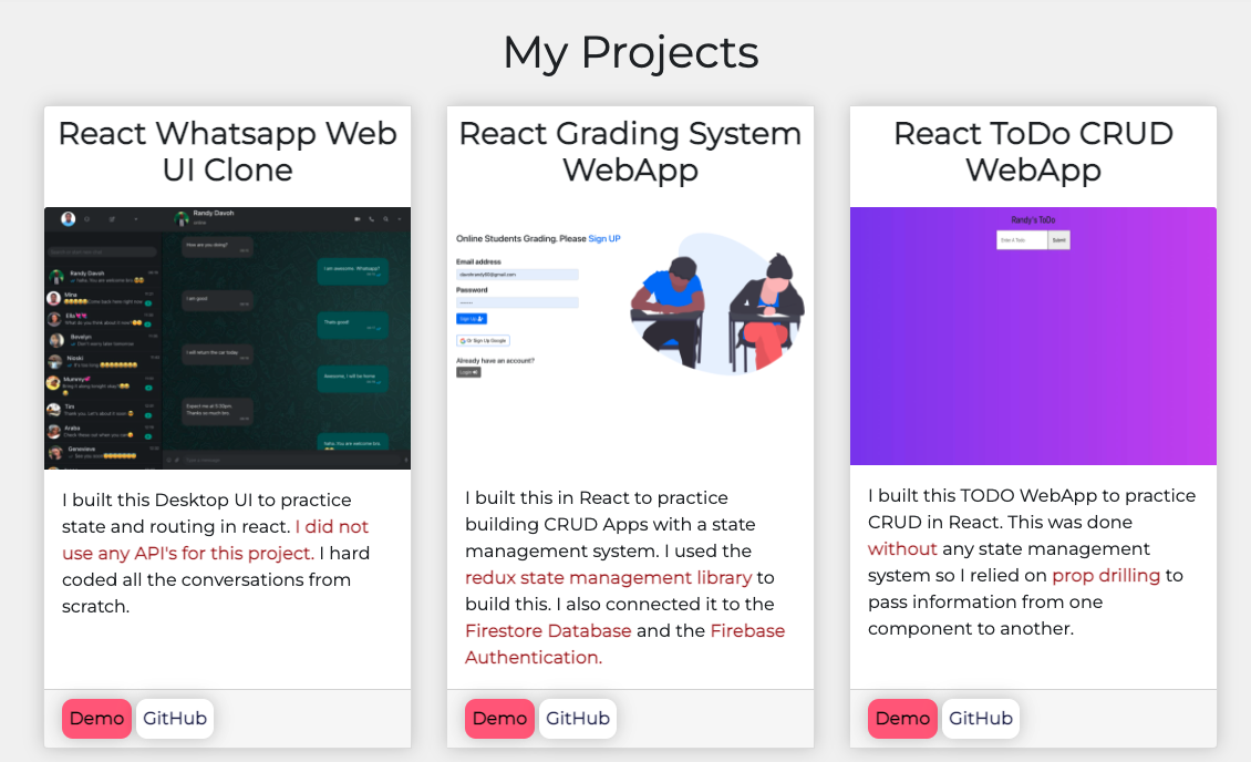
Randy's portfolio contains a nicely layed-out portfolio section using a grid system and two links under each project for a demo and a Github link. Nice of him to include both!
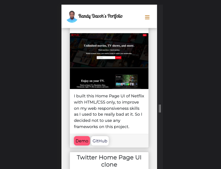
Responsive layout
Randy took the time to make his portfolio's layout responsive to both desktop and mobile screens. Excellent work!
Usage of semantic HTML elements
Randy makes good use of semantic HTML elements like <nav> and <section>
What could be improved
Usage of HTML elements
Although, as I mentioned, Randy makes good use of nav and section, some more HTML elements could be used. For example, the header of the page could use a <header> tag, the footer could use a <footer> tag.
Furthermore, the <h1> tag is used as the heading for each section (My Projects, Skills & Tech etc). The h1 should be used only once per page, so these headings are better being turned into h2 tags.
A form in Get in Touch
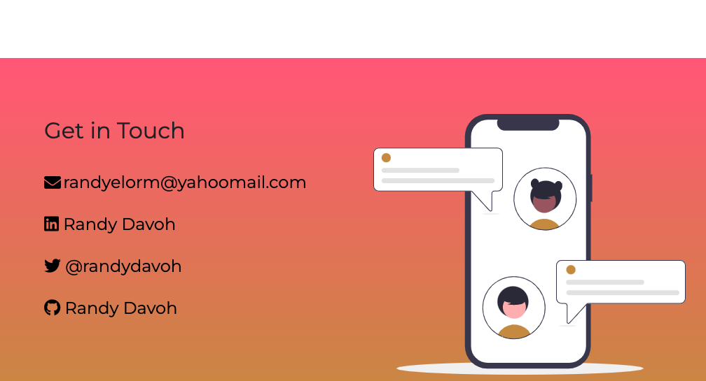
Although Randy has provided a few ways visitors can get in touch with him, should they need to, I think a form would be a better, easier way for others to get in contact with him.
The project links
I have praised the links under each project, but there's a problem.
Each link is both a <a> and a <button>. This is bad for keyboard accessibility as someone using a keyboard will have to Tab twice in order to go to the next element.
So this:
<a href="/">
    <button>Go somewhere</button>
</a>
…is needless and could be just:
<a href="/">
    Go somewhere
</a>
Social media icons need names
Social media icons are nice, but they need names or labels. For example, the icon for Github is just:
<a href="/">
    <i class="fab fa-github"></i>
</a>
A screen reader will have no idea what to announce. A better way to do this would be:
<a href="/" aria-label="Go to my Github profile">
    <i class="fab fa-github" aria-hidden="true"></i>
</a>
Conclusion
Randy Davoh's portfolio is a great example of a well-layed out responsive website. Some nice projects there, but some improvements are necessary to improve accessibility.
Score: 6/10
Reviews (14 part series)
- Website review #1 - Cadejo.Dev (Vinicio Vladimir Sánchez Trejo)
- Website review #2 - Concrete and Lavender (Maria Spyrou)
- Website review #3 - Twitter Butler Digest
- Website review #4 - Coding with Ease (Godspower Eze)
- Website review #5 - Catalin Pit
- Website review #6 - Agathe Badia
- Website review #7 - DenisWritesCode (Denis Mutinda)
- Website review #8 - Timothy Adeyeye
- Website review #9 - Fauzi Arda
- Website review #10 - Tech Stack Banner (Andy Griffiths)
- Website review #11 - Baljeet Singh
- Website review #12 - Gabriel Lazcano
- Website Review #13 - SoftWar by RepublicOf1 (Benjamin Green)
- Website review #14 - Randy Davoh