Website review #3 - Twitter Butler Digest
Introduction
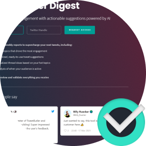
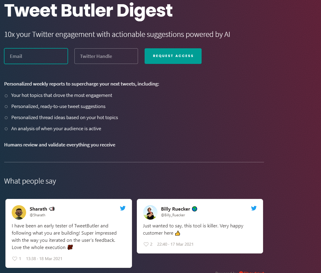
Tibo submitted the website for his product Twitter Butler Digest as a reply to my tweet. Here is the website.
The good
Powerful in its simplicity
Everything is a single page. The request form, testimonials, and descriptions are all together. Simple and effective!
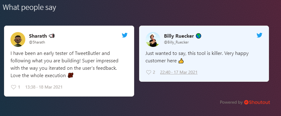
Testimonials
What better way to sell your product than with showing what people think of it! A nice touch and definitely a selling point!
Straightforward access request form
An email address, a twitter handle and a button. That's it. Probably takes 2 seconds to send. No complicated questions, just a beautiful responsive form. Kudos!

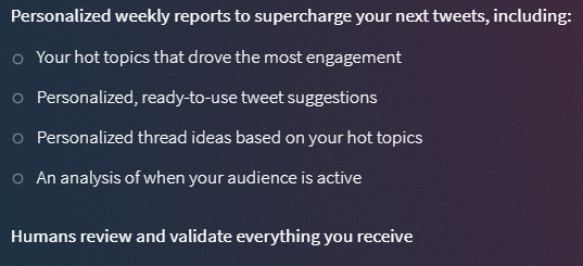
Clear description of what the product does
If you're visiting the page for the first time, you'd like to learn more about the product. The 4 bullet points are more than enough to get you up to speed and make a decision on whether to sign up or not.
Nice colour scheme
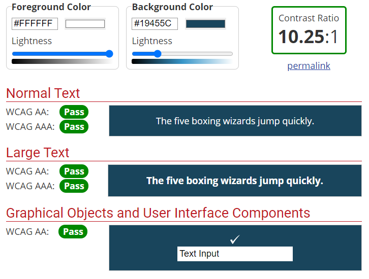
I always appreciate a dark colour scheme when I see one. Dark background on light text. Much easier on the eyes. Tibo does a brilliant job at creating a distinct colour scheme. Plus it has a nice contrast for accessibility!
Suggestions for improvement
Screenshots
The description is nice but I would like to see some screenshots of what to expect after I sign up. How do the reports look like?
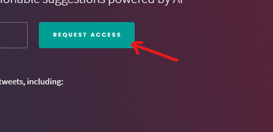
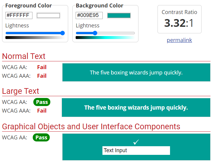
Request Access button contrast
This is an accessibility issue. The Request Access button on the form last sufficient contrast:
Below is the Web AIM Contrast Checker result:
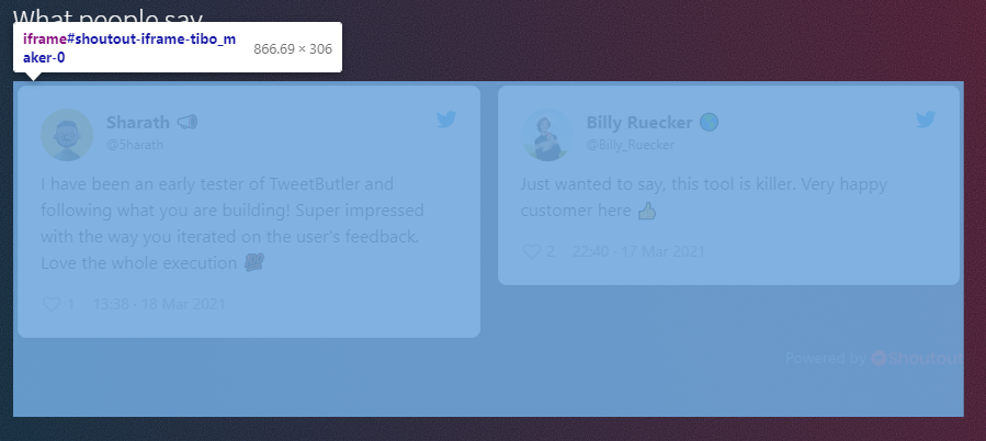
<iframe> needs a title
The testimonials section is surrounded by an <iframe> element. iframes need a title in order to be fully accessible:
Twitter link needs a discernible name
The Twitter link at the bottom is basically an <a> tag with an <svg> inside it. Screen readers don't know how to describe this to their users unless there's some text describing it. An aria-label will do the trick.

Conclusion
A simple, effective website, with a clear description of what the product is about. Some minor accessibility issues.
Reviews (14 part series)
- Website review #1 - Cadejo.Dev (Vinicio Vladimir Sánchez Trejo)
- Website review #2 - Concrete and Lavender (Maria Spyrou)
- Website review #3 - Twitter Butler Digest
- Website review #4 - Coding with Ease (Godspower Eze)
- Website review #5 - Catalin Pit
- Website review #6 - Agathe Badia
- Website review #7 - DenisWritesCode (Denis Mutinda)
- Website review #8 - Timothy Adeyeye
- Website review #9 - Fauzi Arda
- Website review #10 - Tech Stack Banner (Andy Griffiths)
- Website review #11 - Baljeet Singh
- Website review #12 - Gabriel Lazcano
- Website Review #13 - SoftWar by RepublicOf1 (Benjamin Green)
- Website review #14 - Randy Davoh