
Website review #10 - Tech Stack Banner (Andy Griffiths)
Introduction
Back in March when I posted this tweet for followers to submit their websites for me to review, Andy Griffiths submitted his own with the message:
Just a quick little JavaScript project I built.
Be interested to know your thoughts as not had much feedback yet.
So without further ado, let's look at Andy's little project, Tech Stack Banner:
The Good
A very useful tool
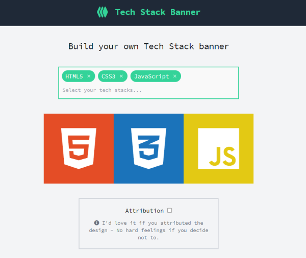
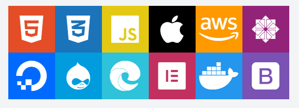
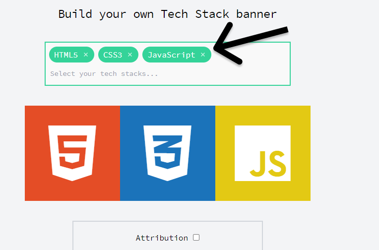
Tech Stack Banner is a tool I haven't seen before but I would definitely see myself using. You could say it's one of those "I didn't know I needed" kind of tool for many who want to show off their skillset in a simple image. The image can be downloaded and used as a Twitter header for example.
Simple and straightforward
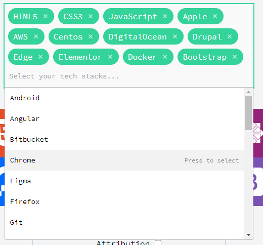
The user interface for this tool is pretty straight forward. Start typing your tool of choice into the box and you'll be immediately get suggestions underneath. Click on one and it immediately goes into your banner as a tile. You can tell a lot of work has been put into making this app!
Fully accessible with a keyboard
As a test, I've tried to use the tool only using a keyboard. I had no issues whatsoever and there was no part of the app I couldn't access without a mouse. Good job!
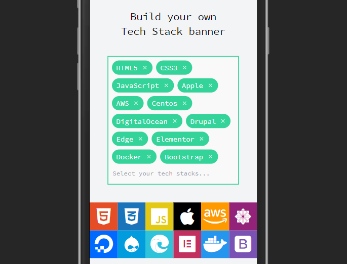
Responsive
The app is fully responsive. I had no problem using the app in a variety of screen sizes without any trouble.
Use of aria-expanded
Andy has made sure screen reader visitors know that the input box is expandable by providing an aria-expanded tag in the input box! That's a major consideration I haven't seen much in tools like this!
Improvements
Use of semantic HTML
While testing the site, I had a look at the source code. Although having just <div>s works well on the surface, I would've liked to see the header in a <header> tag, the footer in a <footer> tag, the main part in a <main> tag and so on.
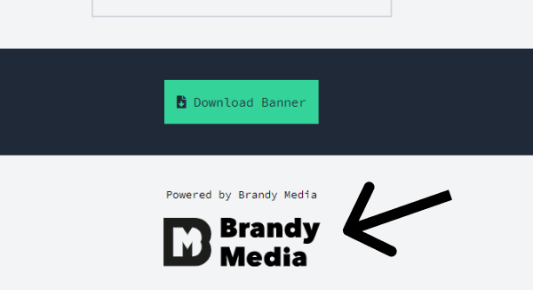
No rel in external links
At the bottom of the page, Andy has provided a link to his business, Brandy Media. This link opens in a new tab. It is good practice however, to have rel="noreferrer" in such links, even though it's your own link you know and trust.
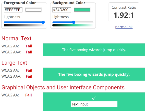
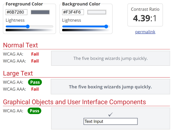
Contrast issues
Some of the text in the app doesn't have sufficient contrast against its background. Most importantly, the list of tech stack items in the input.
This is what WebAIM says about it:
The "I'd love it if you attributed the design - No hard feelings if you decide not to." also has some contrast issues which could affect some of the app's visitors.
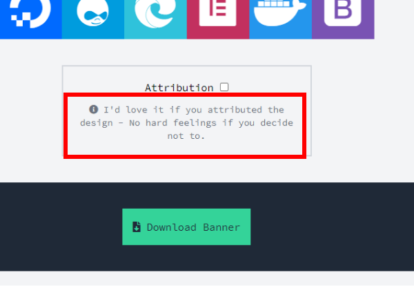
This is what WebAIM says about this:
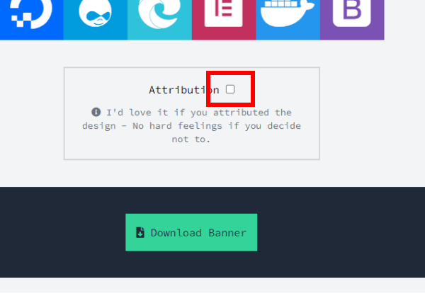
Checkbox without a label
The checkbox next to "Attribution" doesn't have a label or something the screen reader can read back to its user. The text "Attribution" itself could act as the label.
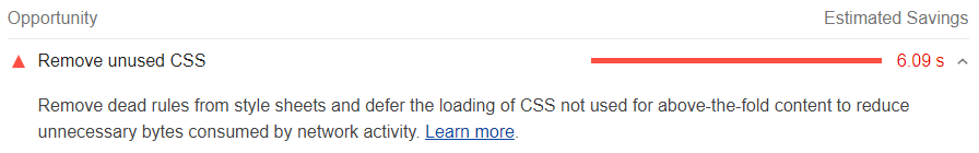
Performance improvements
There is an opportunity to improve performance by removing some unused CSS
Conclusion
Tech Stack Banner is a very useful and easy to use "didn't know I needed" app. Some opportunities for improvement are there.
Score: 9/10
Reviews (14 part series)
- Website review #1 - Cadejo.Dev (Vinicio Vladimir Sánchez Trejo)
- Website review #2 - Concrete and Lavender (Maria Spyrou)
- Website review #3 - Twitter Butler Digest
- Website review #4 - Coding with Ease (Godspower Eze)
- Website review #5 - Catalin Pit
- Website review #6 - Agathe Badia
- Website review #7 - DenisWritesCode (Denis Mutinda)
- Website review #8 - Timothy Adeyeye
- Website review #9 - Fauzi Arda
- Website review #10 - Tech Stack Banner (Andy Griffiths)
- Website review #11 - Baljeet Singh
- Website review #12 - Gabriel Lazcano
- Website Review #13 - SoftWar by RepublicOf1 (Benjamin Green)
- Website review #14 - Randy Davoh