
Website review #8 - Timothy Adeyeye
Introduction
On March 19 this year, I have posted a tweet asking for followers' websites to review on my website. Timothy sent his own. So this is the review of Timothy's website.
This review will focus on 4 areas:
- Usability
- Design
- Responsiveness
- Accessibility
Let's go!
Usability
Usability focuses mainly on delivering what the website is supposed to do.
Skills sections
This website acts as a portfolio. It therefore does a great job at giving details of Timothy's technical background: his education, his work experience, his technical skills and example of his work.
However, this website is lacking something important: Timothy's impact on his work. He doesn't answer how his skills have helped solve problems, either for himself, or the people he has worked for. This is much more important and eye-catching than just a plain list of skills and will make his portfolio more attractive.
Contact options
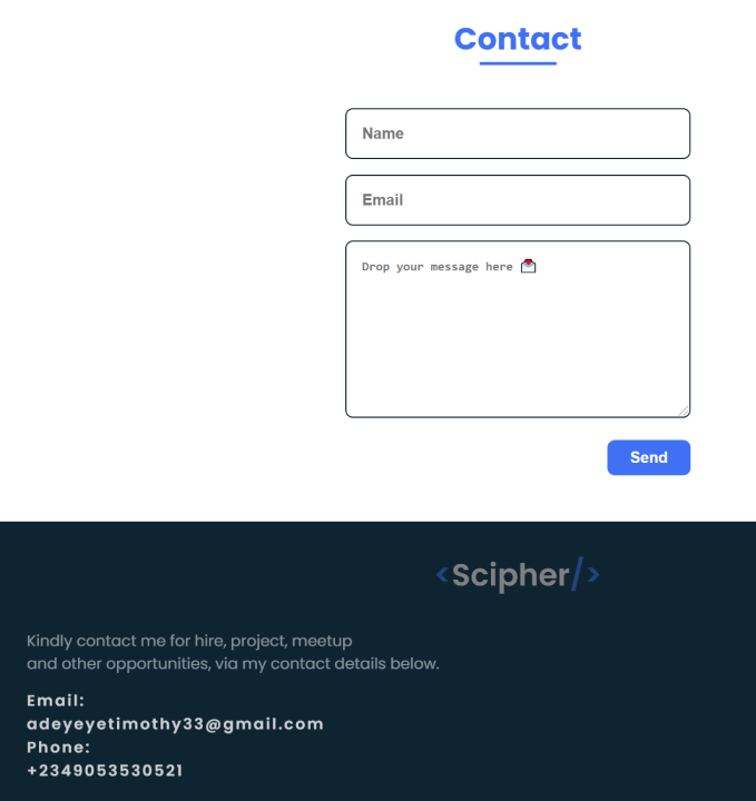
On his website, Timothy has provided several options for people to contact him. A convenient contact form, plus some additional options such as his email address and phone number in the site's footer.
However, it would be a lot more convenient if the email address and phone number were clickable. Maybe use a mailto: and tel: addresses so that people can contact Timothy with a single click or tap.
Running with Javascript disabled
Timothy's website runs great with Javascript disabled. Dare I say, it runs better and more smoothly without it because it doesn't run the animations! Great job!
Link to CV
Although a link to Timothy's CV is great, it opens in a new tab. This means that not including rel="noopener" or rel="noreferrer" to the <a> tag can be unsafe.
See Google's Web.Dev article for more info.
Score for usability: 7/10
Design
Effective single-page site
Everything on the site is on one page. It doesn't overwhealm the reader, however, which is great! It's simple and effective!
Animation
Although having fancy animation on your site can show off your advanced skills in Javascript or CSS, it's not necessarily always a good idea.
Timothy's website seems to make too much use of animation which can make the user dizzy and it can harm the site's accessibility (see Accessibility section).
Text
The text on the site is simple, straightforward and easy to follow.
I would've, however, liked to see the next larger to make it more easily readable.
Score for Design: 6/10
Responsiveness
Hamburger menu
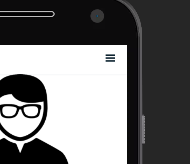
Timothy has provided a handy Hamburger menu on his website to make his site more responsive.
Text padding
When the website is viewed on a phone, on occasion, the text gets too close to the edge of the screen. This can affect the readability of the text so a bit more padding is required, together with an increase in font size discussed earlier.
Points for responsiveness: 8/10
Accessibility
Animation
As discussed earlier, having animation on your website can create issues with accessibility. With that, I mean that animation can trigger discomfort for people with vestibular motion disorders. Almost all operating systems now have the option to reduce motion which can be accessed with a CSS @media query called prefers-reduced-motion. It's best if animation is made optional using this query:
@media (prefers-reduced-motion: no-preference) {
    /* animation stuff */
}
See MDN document for more information.
Keyboard accessible
Pretty much every aspect of the website can be accessed with a keyboard!
Contrast
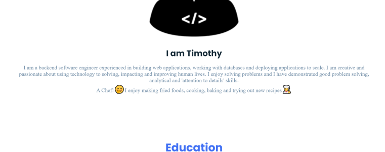
There are some contrast issues between the text and the background behind it. For example, the text under "I am Timothy".
This is what WebAIM has to say about it

Social icons
As with many other websites, the social icons are inaccessible to screen readers because they don't have any text to speak to the user. See this article on how to fix this.

alt tags on images
Some images in the site, correctly have an empty alt text, because they are purely decorative. The image under the "About" section is an example of this. However some images need alt text, even if it's blank since they're purely decorative:
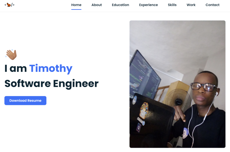
- The hand icon over the tag line text "I am Timothy, Software Engineer"
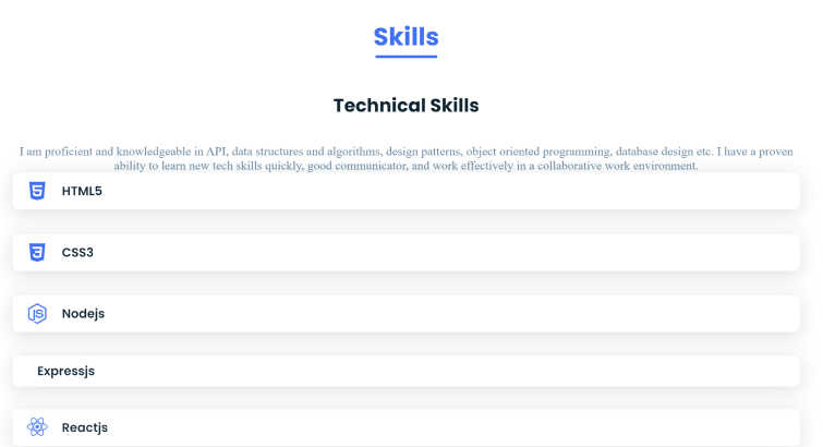
- The icons in the list under "Technical Skills"
Points for accessibility: 6/10
Conclusion
Overall, Timothy has made a website that serves its purpose as a portfolio website. The animation overload, however might make the site difficult to navigate.
Overall score: 7/10
If you're looking for more reviews for inspiration for your next project, see the Reviews section.
Reviews (14 part series)
- Website review #1 - Cadejo.Dev (Vinicio Vladimir Sánchez Trejo)
- Website review #2 - Concrete and Lavender (Maria Spyrou)
- Website review #3 - Twitter Butler Digest
- Website review #4 - Coding with Ease (Godspower Eze)
- Website review #5 - Catalin Pit
- Website review #6 - Agathe Badia
- Website review #7 - DenisWritesCode (Denis Mutinda)
- Website review #8 - Timothy Adeyeye
- Website review #9 - Fauzi Arda
- Website review #10 - Tech Stack Banner (Andy Griffiths)
- Website review #11 - Baljeet Singh
- Website review #12 - Gabriel Lazcano
- Website Review #13 - SoftWar by RepublicOf1 (Benjamin Green)
- Website review #14 - Randy Davoh